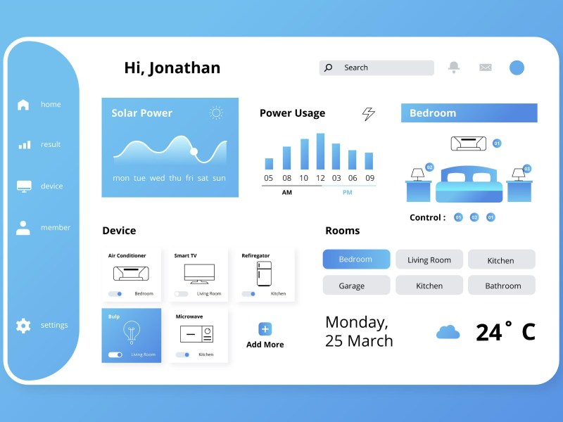
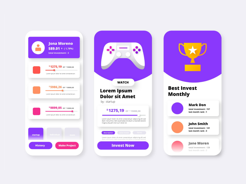
It’s no news that information is all around. As humans, there is a continuous challenge for us to prioritize important messages over clutter. And yet… we often tend to remember the joke in the email, but not the assigned task.
This phenomenon has a psychological explanation, highlighted by Miller’s law regarding how people memorize information. It states that the average individual is able to retain approximately seven (plus or minus two) items in their active memory. The items can be pieces of data, as words or numbers, but also groups of information.
Keeping Miller’s Law at the heart of your design process can make all the difference. It’s not just about being minimalist for the aesthetics. It’s about making your users feel more comfortable using your product.
When you break content into small, meaningful chunks, you make it easier for them to absorb and remember what they see. This lightens their mental load and helps find what they need faster, whether they’re navigating a website, filling out a form, or onboarding into a new app.
It also helps reduce that annoying “too many choices” feeling. By limiting the number of visible options at any given moment, you make decisions feel easier and less overwhelming. This is especially helpful for first-time users who are still getting the hang of things.
And here’s the bonus: not everyone’s memory works the same way. Designing with Miller’s Law in mind means you’re creating a more inclusive experience, one that respects people’s different attention spans and mental rhythms.
- Group Content to Help Users Focus
For memorizing with ease, information must be broken down into “chunks” that are more manageable for the human brain.
Miller’s law is reliable when it comes to designing interfaces that promote smooth user experiences and avoid overwhelming users with too much secondary information.
So, you might want to apply it in every UX design, making sure that you divide messages into digestible chunks. For instance, online shopping sites typically use product categories, filtering options, and structured menus to assist users in browsing vast product collections.
- Implement progressive information exposure
This kind of information exposure is a strategy that aligns with Miller’s law by showing information in a gradual way. This way, users will see small pieces of messages and won’t get overwhelmed by details.
You’ll often see this strategy in multi-step forms, where fields appear progressively based on what the user has already entered. Breaking things down like this reduces mental strain and makes the process feel much more user-friendly.
Using a clear visual hierarchy is key to keeping your users oriented on the page. A great way to leverage this is by visual elements like colour, size, contrast, and, let’s not forget about spacing! These tools don’t just help you to unleash your creativity, but are good options for suggesting a good informational hierarchy too.
Your users’ attention will be guided correctly, and they will be able to process and prioritize information effectively.
Miller’s law teaches us that when there’s too much information, the brain struggles to process it effectively. In UX design, this translates into a golden rule: less is more.
By eliminating unnecessary elements, you free the user’s mind to focus on what truly matters. Clean, minimalist interfaces not only feel modern but actually help users stay on task.
Distractions, whether flashy banners, redundant text, or overloaded menus, pull users away from their goals. Instead, spotlight essential features through smart layout choices and restrained visual design. The result? A seamless experience where users don’t feel lost or overwhelmed, but guided.
- Simplify Users’ Navigation
When users are faced with too many choices or unclear labels, they have a harder time processing the information. This can lead to frustration or drop-off. By limiting options, using familiar patterns, and labeling items clearly, designers can guide users naturally through a product.
Think of it as a well-marked mountain trail: the fewer confusing forks, the smoother the journey. Simple, intuitive navigation help users reach their goals faster, boosting their confidence and satisfaction.
Online stores often break the checkout into multiple small steps instead of dumping all form fields on one page. By asking for shipping info first, then payment details, and finally order review, they keep users focused on one task at a time, making the process feel less overwhelming.
Instead of showing dozens of options at once, many apps use hamburger menus or tab bars with just a few clearly labeled icons. This limits choices to manageable chunks and helps users quickly find what they need.
E-commerce sites use filters to break down thousands of products into smaller, relevant groups. Instead of scrolling endlessly, users can apply category, price, or brand filters step-by-step, easing decision-making.
Good design goes beyond visuals. It’s about creating experiences that make sense to the human mind. Miller’s Law reminds us that our designs should be easy for the brain to process.
In short? Simpler, smarter design means happier, more confident users.
We at uinkits understand the importance of great user experiences and creating amazing UI designs. That’s why we’ve developed a Figma UI Kit with design components that include these essential UI elements that enable you to design intuitive and user-friendly interfaces effortlessly.
“You press the button, we do the rest.” – Kodak.
Inspired by this iconic tagline from Kodak, we believe in simplifying the design process for you. Our Figma UI Kit, uinkits, is a complete design system with UI components that allows you, as a UI UX designer, to create your products as quickly as pressing a button.
Our design system includes UI components, icons, variables, cards, buttons and everything you need for your design process. All you have to do is take your UI design component needed, and you’re ready to use it in your designs!


