Looking back at the app design of mobiles used to have, we can notice one aspect: they all look simplistic and clean. The reason? Simple – we didn’t have the means we have today. And clearly, Figma didn’t exist.
But as with all other technologies, mobile apps’ design have also evolved – just an ordinary advancement trajectory. And UI UX design played a big part in this.
Let’s face it – when you put the original version of Facebook next to its current UI UX design version, the former looks pretty old-fashioned and clumsy. Back then, there was no Figma and no design systems to guide us through the design process. This is the case for all mobile app designs, regardless of whether they are social media apps or not.
But that’s because when mobile apps were first introduced, we weren’t using them at the same level we are now. Because let’s face it – now, it’s easier than ever to access information. Do you want to find out when a celebrity was born? Or when your favorite artist released a song? Or maybe even find the song's name that stuck in your head? You’re one click away.
Even the concept of social media was not quite as it is now. After all, in 2008, when the Apple Store was introduced, no one could have imagined that an app like TikTok existed or that we would become addicted to Instagram and Snapchat. Instead, mobile apps were just means of basic communication, such as messaging, calling, and emailing.
Changing The Focus of App Design
As a result, the emphasis was placed on practicality and functionality – the UX design – rather than aesthetics – the UI design.
Indeed, the UI design was neat and user-friendly, but it lacked the interactivity and sophistication we take for granted in modern-day app designs. But at that time, we were just getting knowledgeable about such developments, so it makes sense to be limited to our technical skills as users.
Even more so, we were also heavily influenced by the limitations of technology. Smartphones were relatively new, and their hardware and software capabilities were concepts that we were just beginning to grasp. For this reason, developers had to design apps that could run smoothly on these devices – but with minimal resources at hand.
A New Era For App Design - Skeuomorphic Design & Flat Design
However, with the rise in the popularity of mobile apps, UI UX designers have started exploring various styles and layouts.
Where did this lead to? The advent of skeuomorphic design – which means that it’s an approach that mimics real-world objects and materials. In fact, it was predominant in early versions of Apple’s apps – Notes and Contacts. However, the skeuomorphic design was widely criticized for being too cluttered and distracting, and we gave up on it to quickly move to a more minimalistic approach.
So that’s when flat design started marking waves and took us to a significant turning point in the evolution of mobile app design! What differentiated these two approaches was that flat design simplified the user interface by removing any unnecessary elements. For this reason, the focus of the designers moved to typography, color, and shape – improving the UI design. Do you remember when Instagram changed its original camera icon logo to the current purple-to-yellow gradient one? Exactly, this was the flat design revolution.
40% OFF
Only this December
Upgrade to UI PRO version of Uinkits Systems to unlock 23.000 UI components.
Use the code "DEC40"
App Design Today and Figma
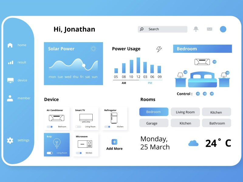
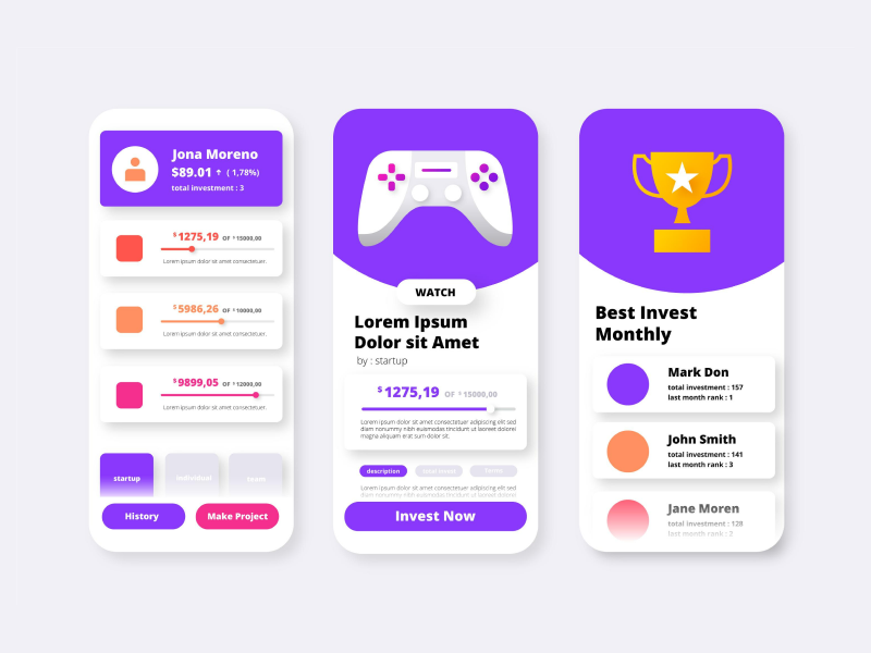
Now, we have moved to more detailed and interactive versions, not only transforming mobile app designs’ look but also how using them feels. Nowadays, we have Figma and design Systems to our advantage, a tool that helps us create and design faster than ever. UI UX designers are now incorporating more animations, micro-interactions, and even 3D elements into their designs while also giving them a bolder appearance.
Figma created plugins, which are libraries of different program apps, making the whole design process more flawless. For this reason, nowadays, these design elements add to the app's visual appeal and enhance its functionality.
It's clear that the evolution of mobile app design that we’ve seen has been nothing but remarkable. From the basic and functional apps of the past to the sophisticated and sleek apps of today. And the best part? It pushes the boundaries to create even more innovative and engaging UI UX designs in the future.
uinkits – Our Figma Design System and UI Kits
We at uinkits understand the importance of inputs in great user experiences and creating amazing UI designs. That’s why we’ve developed a Figma UI Kit with design components that include these essential UI elements that enable you to design intuitive and user-friendly interfaces effortlessly.
“You press the button, we do the rest,” – Kodak.
Inspired by this iconic tagline from Kodak, we believe in simplifying the design process for you. Our Figma UI Kit, uinkits, is a complete design system with UI components that allows you, as a UI UX designer, to create your products as quickly as pressing a button.
Our design system components, including variables, cards, buttons, and everything you need for your design process. All you have to do is take your UI design component needed, and you’re ready to use it in your designs!
By
Cristi Fonea
•
April 17, 2024


