Also known as negative space, white space is the empty area around elements in a user interface, such as images, text, and buttons. Sound simple, right? It’s just a simple area that needs to be clean and free of elements, but in reality, it is more important than you thought.
The white space can be a very useful tool to improve the overall readability of your design or website, to direct users’ attention, and enhance the look of a design.
Modern UI design uses white space intentionally to create clean, organized, and easy-to-navigate interfaces. By giving elements room to breathe, designers can make digital products feel more comfortable and engaging for users.
What Exactly is the White Space?
Think about the space between different elements in a design, and you have the definition of the white space. There are many elements in a design, such as text, images, sections, and even buttons, and the space between them needs to be clearly designed in order to have a great user experience.
Because of its name, many people think that it needs to be white in color, but in reality, it’s really the opposite. It’s also known for negative space, so it simply refers to the empty or open area that helps designers separate the content.
You must know that in design, there are two different types of white or negative space:
- Micro white space - small gaps, such as the space between letters, lines of text, or icons
- Macro white space - a larger area that sits between blocks, sections, and groups of content.
Even though they are so different, they are both important because without them, the information will be very hard to read, and users will not be able to concentrate on what matters the most. When integrated strategically in a design, they help to balance and organize the overall look of the user interface.
Why Does It Matter So Much In A UI Design?
White space plays a crucial role in making user interfaces clear and easy to use.
One of its main benefits is improving readability, so when text and other elements have enough space around them, users can scan information and understand it better.
White space also helps guide attention to the most important parts of a screen, like buttons, forms, or key messages. It creates a sense of balance and harmony, preventing the interface from feeling cluttered or overwhelming.
In addition, white space can affect how users perceive a product. Interfaces that use space effectively often feel more modern, clean, and high-quality.
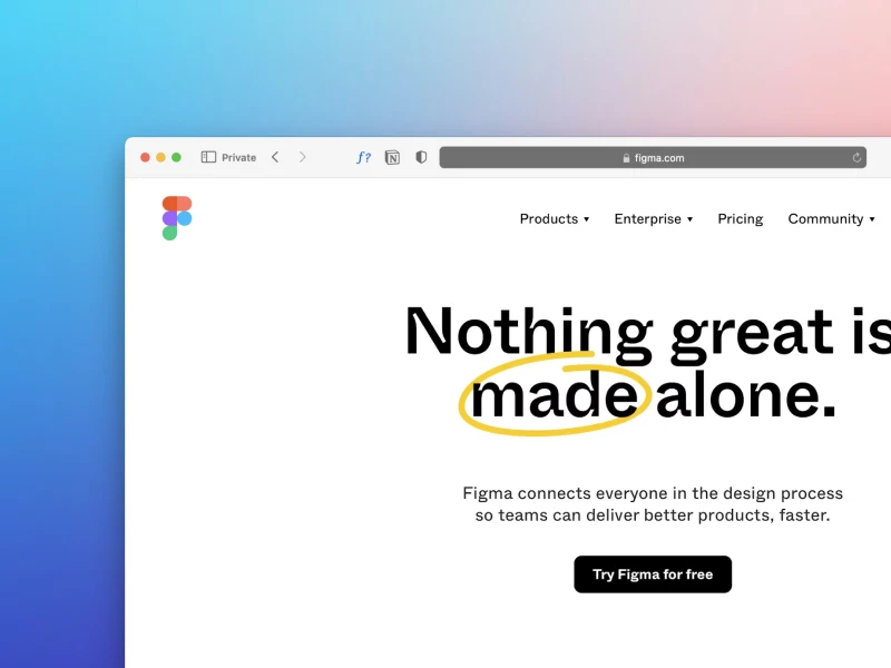
There are many websites and apps like Google and Apple that rely on white space to make their designs visually appealing and easy to navigate. By giving elements room to breathe, designers can reduce stress and make the overall experience more enjoyable for users.
40% OFF
Only this February
Upgrade to UI PRO version of Uinkits Systems to unlock 23.000 UI components.
Use the code "FEB40"
Best Practices for Using White Space in Modern UI Design
Using white space effectively requires careful planning. The first step is to prioritize content. Designers should decide what is most important and give those elements enough space to stand out. Consistency is also key. Using similar spacing for headings, text, buttons, and images helps create a clean and organized layout that feels balanced.
Typography and white space work hand in hand. Increasing line height, adding space between paragraphs, and choosing readable font sizes allow text to breathe and make content easier to scan. Negative space around buttons, icons, and images also helps these elements get noticed without overcrowding the interface.
Responsive design should also be considered. White space must adapt to different screen sizes so that content remains clear and readable on both mobile devices and desktops. Finally, testing with real users is important. Observing how people interact with a design can reveal whether spacing helps them navigate easily or if adjustments are needed.
Common Mistakes to Avoid
Even though white space is powerful, it can be misused. One common mistake is trying to fit too much content on one screen, which leads to clutter and makes the interface hard to read.
On the other hand, using too much white space without purpose can make a design feel empty or confusing.
Another issue is inconsistent spacing between similar elements, which creates a messy and unbalanced look.
Keep in mind that white space is much more than empty space in a design. When used thoughtfully, it improves readability, guides user attention, and creates a clean and modern interface. It helps users focus on what truly matters and makes digital experiences feel more comfortable and enjoyable.
By
Cristi Fonea
•
May 6, 2026