In the process of creating a design, choosing the perfect notification for your project can sometimes be difficult, because the toast UI design is a crucial element in ensuring that users have a smooth navigation experience.
In the process of creating a design, choosing the perfect notification for your project can sometimes be difficult, because the toast UI design is a crucial element in ensuring that users have a smooth navigation experience.
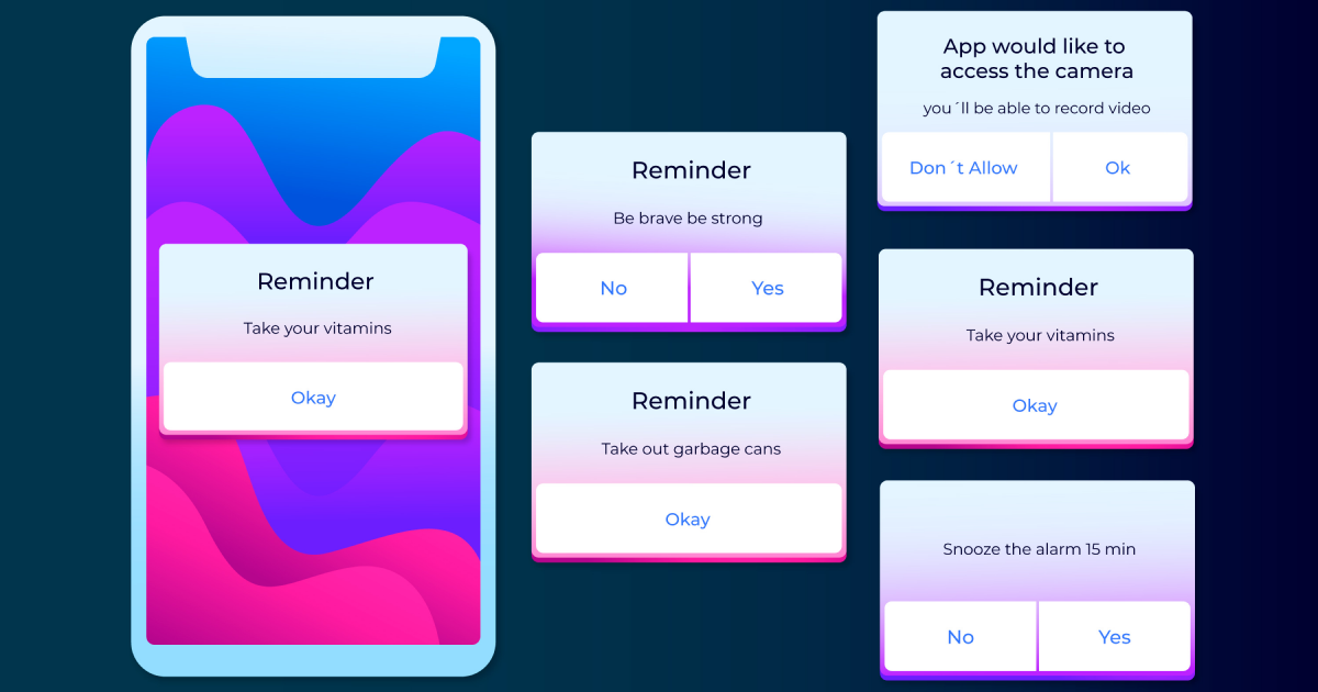
Toast notifications are interface elements that appear on the screen for a limited duration and are usually used to convey information. Why are they called toast, you may ask, but the name comes from the fact that they usually disappear from the screen within seconds. They are similar to pop-up notifications due to the fact that toasts pop up directly on the screen, but do not require the user to close them as soon as they appear.
Toasts serve as a low-attention notification mechanism designed especially to transmit user information, indicate status such as error or success, or, in some cases, prompt the user to take various actions.
For various low-attention messages, they work best for delivering single status updates that don’t require further actions. But it should be mentioned that toast notifications shouldn’t be the primary notification method due to the fact that they are time-limited.
Upgrade to UI PRO version of Uinkits Systems to unlock 23.000 UI components.
Use the code "FEB40"
Because the toast component is specially designed to deliver quick and essential information, it should not be overwhelming when navigating an app or a website. Focus on displaying a text that is short and concise in order to be easily understood by users.
For example, instead of displaying a text that is hard to read fast, such as “Your form has been successfully submitted”, opt for a simpler sentence such as “Form completed”.
A UI toasts design should enhance the user experience, not make it more difficult. It’s important that toasts should be placed in the top corners or at the bottom, in order to be in non-obtrusive areas of the screen.
Keep in mind that usually, subtle animations such as fading or sliding can draw the user’s attention without being disruptive.
An important aspect of a toast dashboard is the screen timing. The ideal duration of the toast component should be somewhere between 3 and 5 seconds to make sure that the users have read all the details without any issues.
In cases where the toast notification informs about the success of an action, it can disappear almost immediately because users will be able to read faster just one or two words.
In every UI/UX design, colors play an essential role because they are able to have an impact on the overall user experience. Same with the toast UI notifications, because it’s important to use a consistent color in order to make the pop-up more distinct compared with the website or app design.
For example, the color Green is usually used in UI/UX design for success and is used combined with messages such as “Your picture was successfully updated”. The color Red is used everywhere for marking errors and is accompanied by error messages such as “Failed to save the previous changes”.
Yellow is mostly used to warn users about an unfinished task, and usually has a similar message as “ Warning: Unfinished form”.
Sometimes, the interaction implemented in the toast UX UI design can improve the overall usability. Consider implementing an “Undo” button in the toast UI design notification to avoid as many mistakes and errors in the user’s actions.
Also, in cases when the website or a page fails to load, try to implement a “Retry” option in the toast UI design. This way, users will be able to solve the problem quicker without having to do other actions, or worse, navigate away from the website or app.
This kind of notification may seem like a simple toast component, but it represents a powerful UI element that is able to significantly improve the user experience by offering almost instant feedback on actions.
Keep in mind that a well-designed toast UI notification must be clear and non-obtrusive in order to make sure that users will see valuable information without being distracted by the actual design. Also, try as much as possible to keep the messages short with relevant colors to allow the users to interact further with the website or app.
We at uinkits understand the importance of inputs in great user experiences and creating amazing UI designs. That’s why we’ve developed a Figma UI Kit with design components that include these essential UI elements that enable you to design intuitive and user-friendly interfaces effortlessly.
“You press the button, we do the rest,” – Kodak.
Inspired by this iconic tagline from Kodak, we believe in simplifying the design process for you. Our Figma UI Kit, uinkits, is a complete design system with UI components that allows you, as a UI UX designer, to create your products as quickly as pressing a button.
Our design system includes components, icons, variables, cards, buttons, and everything you need for your design process. All you have to do is take your UI design component needed, and you’re ready to use it in your designs!
Discover a handpicked selection of UI/UX articles that offer valuable insights, best practices, and the latest trends in digital design.

At uinkits, we're all about the awesome possibilities of design. Join us now and let's shape the future together!