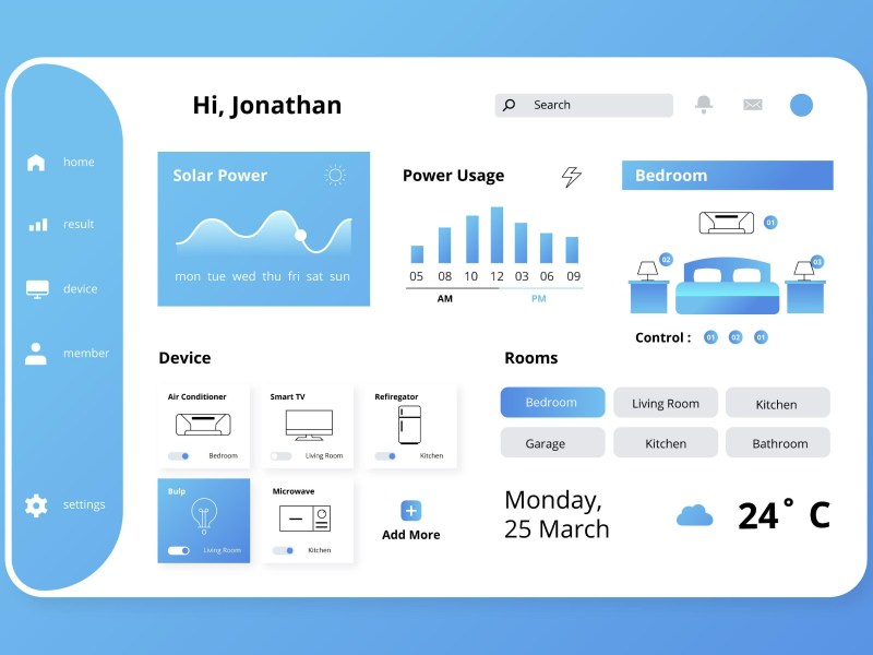
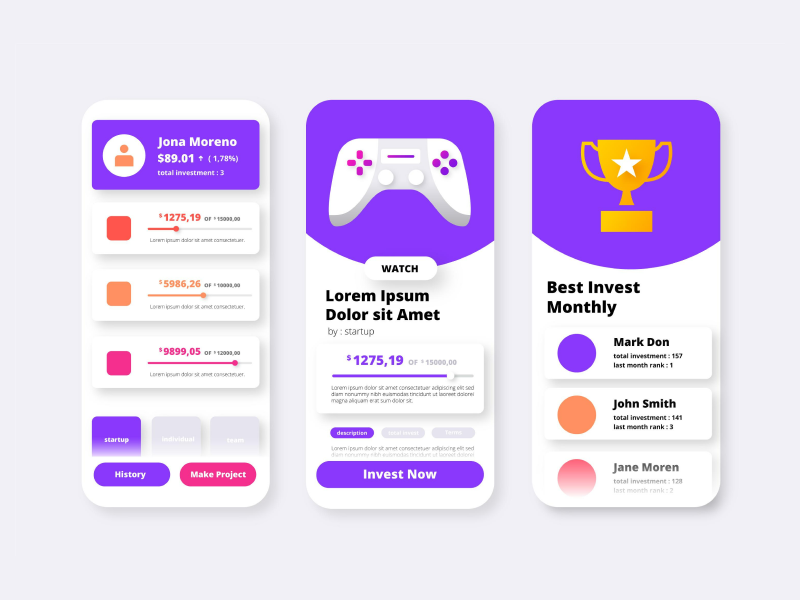
There’s a German proverb – “The devil is in the details” – and when it comes to UI design, dividers are those details that can ake or break your project.
Indeed, dividers might seem like minor elements in the design process. And sometimes, the user’s eye can’t even catch them consciously. But the reality is that both as a UI/UX designer and as a user, there is an intuitive sense of what elements should come next and where they should be placed. And this is the case for dividers as well. Without them, the entire design can lose its sense of structure and coherence – which, yes, it will make your design just look bad.
However, when spending so much time designing an app or a website, we tend to lose attention to details. That’s why in today’s article, we will focus on what dividers are, what are the types of dividers, what alternatives there are for visual separation, and especially when and how to use dividers.
As the name suggests, a divider is a visual UI element separating two or more pieces of content – horizontally and vertically. Its purest form is a subtle but vital line or shape that creates visual distinctions between different sections in our interface by grouping the page into parts or sections.
This way, as UI UX designers, we can create the layout design and structure the information architecture according to the visual perception. Because of this, together with other UI components, these dividers support the visual hierarchy and rhythm on our page. This, of course, will help our users scan the relevant blocks of information much easier, improving the overall user experience.
These visual elements give a more aesthetically pleasing page layout and help create a specific flow, but it’s also the key to increasing usability. Since they often make visual containers, they appear much more clickable and more engageable – which is critical for interfaces where users’ interactions rely heavily on touch.
Okay, we’ve established what visual dividers are. But what exactly are the types of dividers? We can think of everything that can separate two blocks when discussing visual dividers. Colors, gradients, images, lines, and the list can go on. But which one is fit for your UI design?
When analyzing the types of visual dividers, we should group them into two categories: by appearance and by functionality.
1. Appearance
Regarding the appearance of dividers, there are five primary methods used in UI/UX design: lines, colors, images, shadows, and whitespace.
Lines
As UI/UX designers, lines are the first elements that come to mind when we think of dividers. Whether in books, brochures, or websites, or whether horizontal or vertical, lines serve as precise indicators of where something ends and something else begins. Because of the intuitive nature of this UI design element, our users don’t have to think twice about what they mean, as their purpose is embedded in our minds.
Indeed, lines are the safest way to go if you’re looking for visual dividers. However, we need to be careful to avoid overdoing it. Too many lines might clutter the design, removing the original purpose. That’s why lines should not be your only dividing elements.
Color
A great color palette has an amazing psychological effect on our users – we all know that. Just like picking the right colors for your design layout is extremely important, so is making sure that these colors blend naturally (and look good!). The reality is that color dividers are an art.
While it might not come as a surprise, UI UX designers tend to opt for this choice when dividing sections. Why? Well, not only does the color contract make our product look trendy, but it’s also great for influencing visual hierarchy and, simultaneously, the scannability of the page. But just like when it comes to lines, we should pay attention to not overwhelm our users with too many color changes.
Images
Images – the most effective visual dividers. And for a good reason! In interfaces with a lot of text, these images help create the perfect balance between aesthetics and information. Think of blogs, articles, and news websites – these platforms often have a lot of textual content. Without the right design elements, these interfaces can become monotonous, which eventually leads to decreased user engagement.
Photos, animations, 3D graphics, stickers – all of these automatically add to the personality and visual appeal of a product. In fact, the right picture can make or break the design of your product. That’s how powerful an image divider is.
Shadows
Believe it or not, shadows and volume dividers have been a trend in UI design for quite some time. Why? It is simple – it gives everyone a 3D feel rather than a somewhat boring and flat design. And if used correctly, these can elevate our designs, making our platform more interactive and more appealing to the human eye.
Because of the feeling of depth that shadow and volume dividers create and unlike lines, this separation is less obvious and more natural to our users – as if there is no actual separation between the two sections. There’s no wonder UI UX designers love it.
White Space (or Negative Space)
As the name suggests, white space dividers represent the space around (and sometimes inside) the elements. But wait! Just because it’s open doesn’t mean that it’s not useful. In fact, they might be the most efficient dividers as they save space and give our users a cleaner interface. These dividers have become a trend in modern design, giving UI/UX designers a more minimalistic or simplistic approach to their projects.
But if we do decide to opt for negative space dividers, we must do it correctly. And to achieve a clean interface, we must follow the 7 Gestalt principles of visual perception.
2. Functionality
Regarding the functionality of dividers, there are five basic methods used in UI/UX design: full bleed dividers, inset dividers, and middle dividers.
Full-Bleed Dividers
Full-bleed dividers are UI elements that separate the span of the whole screen and the sections. These are usually used when we want to emphasize the separation, putting a bigger accent on a certain section. When negative spacing isn’t enough, full-bleed dividers should be your go-to divider – especially if there are no other anchor elements (such as stickers or photos).
Inset Dividers
Inset dividers are used when we want to separate the content that is related to each other – such as the sections in a list of contacts that is ordered alphabetically. This type of divider aligns with the rest of our content and helps our users understand that there is a classification made that requires a specific flow.
Middle Dividers (or Centered Dividers)
As the name suggests, middle dividers imply that there is a separation of elements in the middle of the layout. These dividers are usually great when indicating the price on a receipt or an order summary in the checkout process.
Choosing the right type of divider for our layout is an art. Not only that they should not distract our users from the relevant information, but they should also be placed in such a manner that they don’t stand out. Dividers should blend with the layout and the content – not be the content. So, how can we make sure that we use dividers correctly?
As I said – “the devil is in the details” – and this is how dividers should be. The key is to strike a balance between creating visual separation and maintaining a cohesive design. So, be subtle, keep it simple, and avoid overly complex dividers that may distract our users from the content. They are the structure, not the content. And simple dividers can be just as effective in providing separation without overwhelming the user.
And if you are using color or image dividers, you should also be mindful of the contrast. So, make sure that they are visible but not annoying.
Remember! Just because you can add many dividers doesn’t mean that you should. Too many dividers – especially lines – can create visual noise, which can clutter the design and overwhelm the user. Instead, focus on using dividers strategically to guide the user’s attention and create a clean, organized layout.
Less is more! Embrace minimalism when it comes to dividers and only use them only when necessary!
Placing the right dividers is an art. And more often than not, as UI/UX designers, we tend to get lost in our designs. So, get feedback from users to understand how they perceive the dividers and if they find them helpful or distracting.
But if you want to have an even better view of dividers, try A/B testing. There’s no better way to gain valuable insights into how our users interact with different styles and placements!
Remember that the goal of dividers is to improve usability and readability, not to distract or overwhelm users.
We at uinkits understand the importance of dividers in great user experiences and creating amazing UI designs. That’s why we’ve developed a Figma UI Kit with design components that include these essential UI elements that enable you to design intuitive and user-friendly interfaces effortlessly.
“You press the button, we do the rest,” – Kodak.
Inspired by this iconic tagline from Kodak, we believe in simplifying the design process for you. Our Figma UI Kit, uinkits, is a complete design system with UI components that allows you, as a UI UX designer, to create your products as quickly as pressing a button.
Our design system includes components, icons, variables, cards, buttons, and everything you need for your design process. All you have to do is take your UI design component needed, and you’re ready to use it in your designs!


