Nowadays, when creating a UI design, the first question we always ask ourselves is: “Okay, but how will it look on mobile?”. This is especially true regarding the navigation tab – the sidebar.
But it shouldn’t come as a surprise – we live in a mobile-first world. More and more people rely on mobile phones to access the internet rather than through any other medium. It makes sense! After all, it’s much easier to just reach for our pockets and open our phones whenever we need to do something or to look for something.
And it shows! In 2023 nearly 57% of the global online traffic is made up of mobile traffic. This isn’t a recent trend, and clearly, it isn’t going anywhere either.
Because of this, as UI/UX designers, we have started prioritizing the appearance and functionality of our designs on mobile screens over traditional website screens. But when adopting a mobile-first mindset, we are challenged to think differently. It’s not enough to just create a website design for desktop screens, and we’re good to go, hoping that it will automatically translate well to mobile devices.
The reality is that mobile users have different needs and behaviors compared to desktop users. Every UI/UX design aspect needs to be tailored to the mobile experience, from font choice to layout and interaction patterns.
But UI UX designers must always remember: mobile screens are limited in space. This changes everything in the user interface design and user experience as everything will become much smaller, and we won’t have that much space to add everything. Not in the way that they are designed on desktops, anyway.
For a good design, this may call for rearranging, prioritizing, or even omitting certain elements that are present on desktop interfaces. And this is the case for sidebar navigation!
What Are Sidebars?
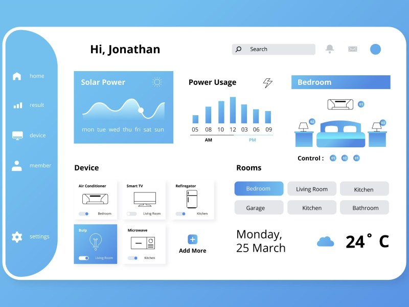
First things first, let’s establish what sidebars are exactly. As the name suggests, a sidebar is basically a vertical column placed to the sides of a digital platform’s interface that gives our users extra information. Its content and layout can differ from website to website and platform to platform. Still, its main purpose is to complement the primary content and give our users a more accessible method of accessing relevant information.
In the context of web design, sidebars often contain links to different pages, categories, or areas of the website design. They can display menus, search bars, social media links, advertisements, and other content. On the other hand, in applications, sidebars help users navigate between different views or functionalities. They can host icons, buttons, or text links representing specific actions, settings, or categories relevant to the app.
Can We Use Sidebars on Mobile Screens?
Well, the answer is yes, we can. But it’s not recommended. Think about it! We already have limited space on phones. And no matter how vital the sidebar is for your user experience, giving a third of the page to secondary content just becomes impractical.
For this reason, designers may use a collapsable sidebar that appears when needed and can be hidden when not in use. Do you know the hamburger menu? Well, In UI design, this is called a drawer. This approach allows our users to access navigation options when necessary without obstructing the primary content on the screen.
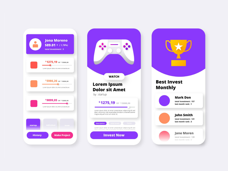
In some instances – especially for app development – designers have even migrated from Sidebars to Tab Bars. This transition is driven by the desire to optimize the user experience on smaller screens and make essential features more accessible and intuitive. Instagram, TikTok, LinkedIn – all of these big platforms have embraced the tab bar as their primary navigation interface on mobile devices. X (ex-Twitter) even has both a drawer and a tab bar.
40% OFF
Only this December
Upgrade to UI PRO version of Uinkits Systems to unlock 23.000 UI components.
Use the code "DEC40"
Do We Need Sidebars In a World of Mobile-First?
We have already established that implementing a sidebar in our UI/UX design might be tricky and that we should use alternatives – tab bars or drawers. So, in these situations, as UI UX designers, we ask ourselves – Should we still use sidebars on desktop screens as well?
Sidebars have been a “must-have” in every web design for a decade already. But with the mobile-first approach, some designers sometimes choose not to use sidebars at all. Not even on desktop screens. But while this decision might be justifiable on mobile devices, not introducing a sidebar in our UJI/UX designs means that we can’t take advantage of their benefits. And well, even though we live in a mobile-first world, we can’t just neglect our desktop screen layout.
Desktop interfaces still hold significant importance. Especially for certain industries or tasks that require more extensive interactions or a larger display. In fact, there are instances where our users prefer using desktop devices for specific activities, such as content creation, data analysis, or other complex web applications.
Advantages of Using Sidebars
- All the elements are visible and noticeable.
- Sidebars offer a dedicated space for navigation links, menu items, and quick access to important sections of a website – content that otherwise might not fit on the page.
- Sidebars allow us to categorize and group related content, making it easier for our users to locate specific information without feeling overwhelmed by clutter.
- We can include call-to-action buttons that increase engagement and encourage people to explore more parts of the website – “Buy Now”, “Sign Up”, the newsletter box, etc.
- Sidebars can adapt to different screen sizes through responsive web design.
- Maintains consistency and familiarity for users, making it easier for them to interact with the site as they navigate between different pages.
Disadvantages of Using Sidebars
- Takes up a lot of the screen, reducing the available space for the main content.
- It can distract our users from the main content, especially if we include too much information or unnecessary elements.
- Adds visual complexity to the layout, making it harder for users to focus on the essential content – and if not placed correctly, it can create visual noise, cluttering the design.
- Sidebars might not align with the platform's overall visual aesthetics or branding.
- Our users might feel confused and overwhelmed if it contains too many links, options, or features.
Uinkits – Our Figma Design System and UI Kits
We at uinkits understand the importance of great user experiences and creating amazing UI designs. That’s why we’ve developed a Figma UI Kit with design components that include these essential UI elements that enable you to design intuitive and user-friendly interfaces effortlessly.
“You press the button, we do the rest,” – Kodak.
Inspired by this iconic tagline from Kodak, we believe in simplifying the design process for you. Our Figma UI Kit, uinkits, is a complete design system with UI components that allows you, as a UI UX designer, to create your products as quickly as pressing a button.
Our design system includes components, icons, variables, cards, buttons, and everything you need for your design process. All you have to do is take your UI design component needed, and you’re ready to use it in your designs!
By
Cristi Fonea
•
August 9, 2024


