As UI/UX designers, we should be fairly familiar with the minimalism current. Let’s take a deeper dive and explore how we have reached a point in UI UX design history when we can declare it as being the most popular design choice.
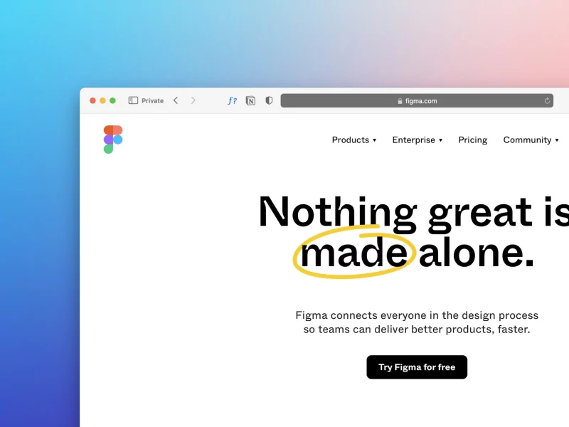
Functionality, simplicity, and clarity, with a dash of aesthetics. This is seemingly the perfect combination for a minimalist design - and it's exactly why Apple is the best example of a minimalist design. You probably interact with at least a manifestation of the minimalist current in your day-to-day life.
It could be the fact that the decor in your house is simple in nature and has a clean aesthetic that is meant to serve functionality. Or perhaps, it may be the all-black outfit you put on this morning to go to work. Maybe it is the way your office building is organized, with big windows and all-beige architectural elements.
Minimalism Beginnings
From the cars we drive to the places we attend, we can all agree that minimalism has a big impact on our lives. However, compared to other styles, minimalism is far from being a tale as old at times. To be more specific, it is believed that minimalism has its earliest roots in the 1960s when artists were starting to stray away from more intricate sources of inspiration. As a response to the then-still-popular abstract expressionism movement, many creatives were resorting to simpler shapes and lines.
Even though in the 60s and 70s, minimalism was capturing a lot of the public’s attention, decades such as the color-pop-fueled 80s and the super-flashy early 2000s meant that we saw a lot of alternation between trends and styles. For the past 15 years, however, the design landscape which encompasses trends for every single field, from lifestyle to work ethics, has been clearly dominated by minimalism. But how exactly did we get here?
40% OFF
Only this February
Upgrade to UI PRO version of Uinkits Systems to unlock 23.000 UI components.
Use the code "FEB40"
Should we blame the Great Recession?
It was 2007, the skirts were mini, the lines in front of the club entrances were long and loud, and people were rocking rhinestones with seemingly every outfit they wore. What a time to be alive! Today, we will focus on two major events that blossomed this year. The first one is Steve Jobs announcing the launch of the first iPhone. It was the type of event that took the world by storm and broke barriers that seemed to be harder to conquer until there. While the first touchscreen phone had already been invented back in 1992, the iPhone was bringing this technology forward to the larger public.
Do you remember the other huge event that was about to take the world by storm? It was the great recession. With this huge blow to the worldwide economy, a lot of things were about to drastically change. People were now faced with a new economic landscape that demanded them to conserve their resources, spend less money, and trade more opulent lifestyles for more modest ones. And it was not only the obvious changes, such as drops in luxury items sales but the way we treated design overall - which can also be easily observed in the digital realm.
Although the Great Recession certainly turned the balance in favor of minimalism to flourish in the UI UX design sphere, there are more reasons why more and more UI/UX designers shifted their focus toward this stylistic movement.
The Art of Minimalism in UI UX Design
Besides the socio-economical motivating factors, there are other reasons why minimalism is so popular for UI design. First of all, minimalism is more than just a trend that can be applied to the user interface, it is a philosophy that can be used to enhance the way we interact with technology.
Minimalist designs can improve the user experience because they eliminate the elements that are not necessary. With a well-thought-out minimalist UI design, we can increase traction to our websites and apps. Plus, a simpler design will generally make a web page more accessible and user-friendly.
If we want to take a look at one of the most successful and iconic integrations of minimalism in UI/UX design, we should look no further than at Apple’s user interfaces. Most people who become new Apple users do not require a lot of time to get accustomed to their design system. And it is quite easy to see why - their user interfaces are intuitive, well-organized, and visually stunning. They communicate a great story by using the least amount of elements that can be implemented. Love it or hate it, we can all learn a few things about minimalism by looking at Apple’s design system.
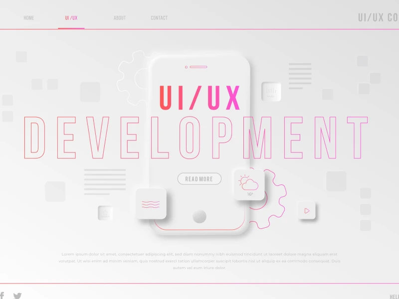
How to Integrate Minimalism in UI UX Design
Let’s take a look at a few design principles that we can apply to our UI/UX design in order to ensure a minimalistic effect that enhances the user experience.
- Simplicity
One of the most popular design principles related to minimalism is simplicity. In UI/UX design, 9 out of 10 times less is really more. A simple design has a higher chance of getting the point across, while also ensuring smooth and clear navigation.
- Negative Spaces
In minimalism, negative spaces serve as a means to highlight the main content on a page. No empty space is wasted, but it is implemented instead to emphasize other user interface components.
- Flat Design
Another aspect that we should take into account during the design process of apps and websites is the integration of flat design. Now almost synonymous with minimalism, flat design ensures more readability and visual coherence. As opposed to skeuomorphism, flat design is more accessible to more varied categories of users.
- Quality over Quantity
Minimalism is all about sticking to the elements that are necessary and ditching the ones that do not serve a real purpose. Although we might often be tempted to add visual components that look aesthetically pleasing, if that’s their only contribution to the UI design we might want to think twice about keeping them.
- Limited use of Effects
Lastly, a strategy we can implement to ensure minimalism in our UI designs that also enhances the user experience is to use a limited amount of effects. While it might be tempting to show off our 3D skills and knowledge of skeuomorphism, this is yet another case of less is more that prioritize functionality over aesthetics.
uinkits – Our Figma UI Kit
We at uinkits understand the importance of inputs in great user experiences and creating amazing UI designs. That’s why we’ve developed a Figma UI Kit with design components that include these essential UI elements that enable you to design intuitive and user-friendly interfaces effortlessly.
“You press the button, we do the rest,” – Kodak.
Inspired by this iconic tagline from Kodak, we believe in simplifying the design process for you. Our Figma UI Kit, uinkits, is a complete design system with UI components that allows you, as a UI UX designer, to create your products as quickly as pressing a button.
Our design system components, including variables, cards, buttons, and everything you need for your design process. All you have to do is take your UI design component needed, and you’re ready to use it in your designs!