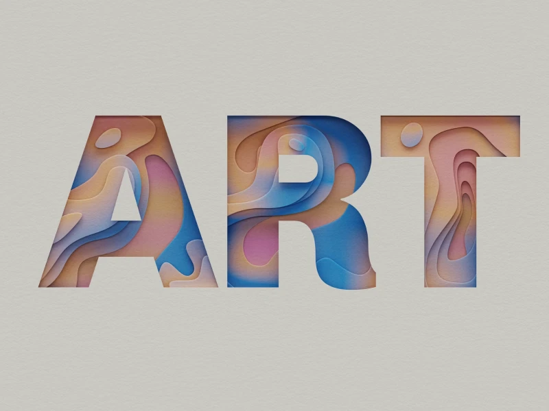
Color makes the difference. Whether we are talking about a sweater or about the best UI UX design that you ever saw, it is in human nature to remember color. Think about it for a moment – we distinguish certain objects based on their color. We like clothes according to their color and we choose what fits us best based on color as well. So, why wouldn’t color be an important matter in UI UX design?
Well, it is. It is what sometimes can make a bigger difference than we imagine. In other words, we can even say that color is a language due to its power of delivering a message or a feeling. And the one that speakers in colors in web and app design is the UI designer.
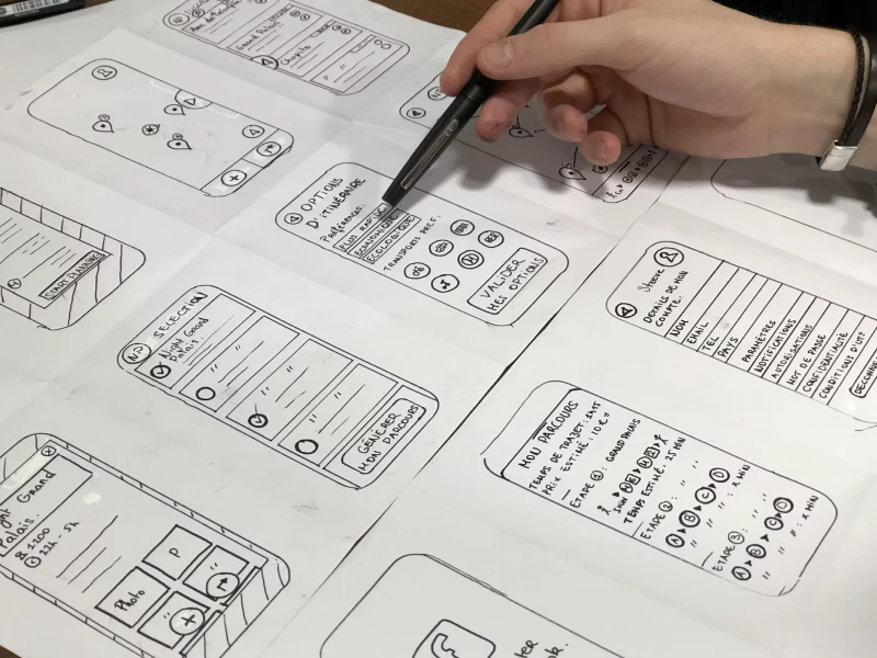
So, naturally, if color is a language that carries meaning we can’t just throw it into our design without thinking about it. And this is why every UI UX designer should have a basic knowledge of the psychology behind colors.
We all can agree on the fact that color has the power to deliver all sorts of emotions. When you imagine the color red you immediately think about big brands such as Coca-Cola, YouTube, or Netflix. You might feel inspired, as the color captures everyone’s eyes even in an app or web design.
Multiple studies have shown that customers and users are more likely to make a decision based on color and visual appearance. So, choosing the appropriate color is the key to a good user experience.
Countless psychology studies attest that each color invokes a distinct feeling inside the viewers. It is essential to remember that the symbolism and meaning of colors can vary based on which cultures we choose to analyze. Therefore, when we are designing a website or creating an app design, we have to research our target audience. Sometimes, even factors such as age, occupation, and gender can vastly influence how a user will interpret a certain color scheme. However, there are a few general traits that can be attributed to each color that we should be aware of:
This bold color instantly captures the attention of the viewer. It is the brightest and hottest hue in the color wheel. While it is great for making an impact, we have to be careful to not abuse it when creating the user interface. Shades of red can become easily tiring to the eye.
Red may be a great choice for a CTA button but a disastrous one for the background of a page. As far as symbolism goes, it evokes feelings of passion and energy but can also emulate anger. News outlets use this color quite a lot.
One of UI design’s greatest cliches is the use of green for subjects related to nature. It also inspires peace, safety, prosperity, and overall positive attributes. If you want to convey that your brand is environmentally conscious, green would be the safest pick.
Green is among the colors that have a calming effect - it could be of great use for somebody who wants to develop a wellness-related website or app. Put simply, 9 out of 10 times, people will associate green with nature.
This is the color of trust. Hence, many UI UX designers choose shades of blue for companies related to banking and user data protection. Blue is also a calming color and is a great alternative for the website design for medical service providers. Depending on the tint of blue, it can be monotonous or communicate the feeling of sadness and longing to the users.
The color of happiness - yellow is striking and sets a positive tone for the design. One of its main associations is with the concept of youthfulness, making it appropriate for apps and websites targeted toward children. As a tip, we should avoid overusing yellow because it can easily become obnoxious due to its brightness.
The most widespread symbolism of purple is creativity and luxury. Throughout history, purple was associated with royalty because purple dye was very inaccessible. The connotation of imaginativeness sends the message that a page will fall into the artsy side when its main theme is a shade of purple. Hence, this hue is a great pick for the UI UX design of websites related to arts, beauty, and fashion. On the other hand, a sports app would not benefit from purple-dominant visuals.
We at uinkits understand the importance of inputs in great user experiences and creating amazing UI designs. That’s why we’ve developed a Figma UI Kit with design components that include these essential UI elements that enable you to design intuitive and user-friendly interfaces effortlessly.
“You press the button, we do the rest,” – Kodak.
Inspired by this iconic tagline from Kodak, we believe in simplifying the design process for you. Our Figma UI Kit, uinkits, is a complete design system with UI components that allows you, as a UI UX designer, to create your products as quickly as pressing a button.
Our design system components, including variables, cards, buttons and everything you need for your design process. All you have to do is take your UI design component needed, and you’re ready to use it in your designs!