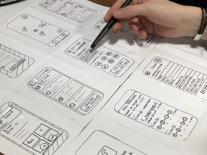
The Pareto Principle, also commonly known as the 80/20 rule, is the idea that roughly 80% of outcomes come from 20% of the causes. It’s named after the Italian economist Vilfredo Pareto, who observed that 80% of the land in Italy was owned by just 20% of the population.
Since then, it’s been applied to economics, business, productivity, and yes, even design!
Understanding the Pareto Principle
If you’re still asking yourself, “Why is this relevant nowadays?”, you should know that the Pareto Principle is more useful than ever. In simple terms, Pareto’s Law tells us to focus on the small things that make the biggest difference.
When it comes to UX, this means identifying the 20% of features, layouts, or interactions that drive 80% of the value for your users. The result? We make smarter design decisions, everything is less cluttered, and everyone is happy.
Why the Pareto Principle matters in UX Design
UX design is a job full of decisions. What content should I prioritize? What features should I highlight? How do I make things feel intuitive? The Pareto Principle helps simplify that process.
Still confused? Instead of trying to do everything perfectly, you focus on what users actually care about most.
The 80/20 rule in design might look like this: 80% of user activity happens in 20% of your app’s screens. Or 80% of support tickets come from 20% of confusing features. When you identify that critical 20%, you can put your energy where it has the most impact.
40% OFF
Only this February
Upgrade to UI PRO version of Uinkits Systems to unlock 23.000 UI components.
Use the code "FEB40"
The 80/20 Rule in UI/UX Design in Action
Let’s say you’re designing a dashboard. Out of ten available tools, your analytics show that two are used way more than the rest. Instead of giving everything equal space, you highlight those top two.
Or imagine a mobile app where users consistently get stuck on the same two screens. Rather than redesigning the entire flow, the Pareto Rule would suggest fixing those two screens first. That one change could potentially eliminate 80% of the user friction.
In e-commerce design, 80% of your revenue might come from 20% of your products. That insight could influence everything from layout to how you design your filters, search experience, and promotional areas.
Why Should I Use the Pareto Principle in UI/UX Design?
What I personally like about using the Pareto rule is that you don’t have to take guesses. It’s a practical way to focus your design efforts. You don’t need to chase perfection. You just need to understand what’s driving results and make sure it’s fast and accessible for users.
It’s cause and effect, plain and simple.
How to apply the Pareto Principle to UX design
Applying the Pareto Principle to UX design is all about identifying what your users actually want and prioritizing that. The idea itself is simple: 80% of the value people get from your product probably comes from 20% of its features.
And your job? Figure out what that 20% is.
My advice is to use tools like HotJar (for heatmaps) or Google Analytics to see where users spend most of their time, or where they drop off. Map out user flows. Identify which parts of the journey lead to the most conversions, engagement, or drop-offs.
Once you find your top 20%, don’t be afraid to reduce or simplify the remaining 80%. Cleaner designs usually win! The beauty of the Pareto Rule (aka Pareto’s Law) is that it helps you make smarter decisions without overcomplicating things. And that’s exactly what a strong UX strategy needs.
So instead of spreading yourself thin across dozens of screens, features, and flows, step back and ask yourself: what’s my 20%?
uinkits – Our Figma Design System and UI Kits
We at uinkits understand the importance of great user experiences and creating amazing UI designs. That’s why we’ve developed a Figma UI Kit with design components that include these essential UI elements that enable you to design intuitive and user-friendly interfaces effortlessly.
“You press the button, we do the rest.” – Kodak.
Inspired by this iconic tagline from Kodak, we believe in simplifying the design process for you. Our Figma UI Kit, uinkits, is a complete design system with UI components that allows you, as a UI UX designer, to create your products as quickly as pressing a button.
Our design system includes UI components, icons, variables, cards, buttons and everything you need for your design process. All you have to do is take your UI design component needed, and you’re ready to use it in your designs!
By
Cristi Fonea
•
July 7, 2025


