Remember when, sitting at a restaurant, it took you ages to decide because there were just too many choices? You can bet it would’ve taken only 2 minutes if there had been just 3 options.
What is Hick's Law in UX Design?
Hick’s law was created by two psychologists, William Edmund Hick and Ray Hyman, and it indicates that the more options a person has, the longer it will take for him to decide.
In UX design, this law is used in improving the decision-making process and simplifying user choices. For businesses to increase conversion rates, they need to understand Hick’s law and get some smooth UX designs that prioritise important information.
To get a clearer picture, imagine you are signing up on a page. Your screen is filled with open fields if you want to sign up with your email address, but above the other three options are from third-party platforms. Everything feels crowded and you have to choose between 4 options.
How to Use the Hick's Law in UX Design?
Hick’s law makes the assumption that the human brain has a limited capacity for information processing. Indecision or decision fatigue appears exactly when the brain faces too many options. UX designers consider this a valuable rule, and due to this reasoning, they simplify the decision-making process of their users.
In this situation, leveraging user interaction data will give you insights to identify and test user experience aspects. How does it help? You will know how to filter important options and what to get rid of.
With this being said, one thing is clear: we need data!
To act on Hick’s law, you will need a user behavior analytics tool that will help you understand user journeys using sessions recordings, heatmaps, surveys, form analytics and funnels. With this tool, you can measure how users interact with different parts of your website. How often do they click a button? How far do they scroll? Which sections get ignored?
This way, you’ll know exactly which elements aren’t used or which are complicating the user journey.
40% OFF
Only this February
Upgrade to UI PRO version of Uinkits Systems to unlock 23.000 UI components.
Use the code "FEB40"
Examples of Hick's Law in UX Design
For instance, heatmaps could reveal that one of the sign-in options we talked about above receives almost no interaction from users. This indicates it has little use and makes users' decision-making process more difficult.
Funnels will show you the step-by-step path users will take to complete a goal. Why so important? It will help you identify where users abandon the process and spot friction in your flow ( for example, too many form fields or unclear CTAs).
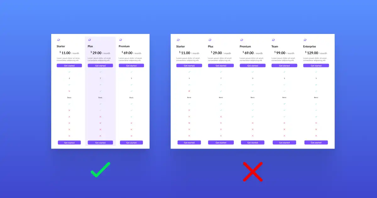
Let’s say several elements were removed to simplify a website action. The question is whether this updated design will generate as much conversion as the original. Testing fast and often is another tactic to revise the options users encounter. Here comes A/B testing to help you measure results quickly and use data to learn and iterate fast.
How to Apply Hick’s Law in UX Designs?
1. Simplify the sign-up process
Often, the first touchpoint in your customer journey is the sign-up page and login page. On this step, the user decides to try your product. Now is the time to prove to him how intuitive and effortless he’ll get what he needs. Lead him to make a quick sign-up decision.
To get this done, keep the action simple. Avoid asking for email confirmation, include a strong headline, and a powerful CTA.
2. Keep welcome surveys short and simple
Whether it’s during sign-up or part of your onboarding process, try to keep those first surveys quick and easy.
Just ask what you really need to make the experience more personal. Usually, that means finding out the user’s role, what they’re trying to get done, and what they hope to achieve with your product. That’s it! No need to overload them from the beginning.
3. Create a clutter-free UI for a better user experience
If you want to help users get things done quickly (and actually enjoy the process), a clean, simple interface is your best friend. How to do this?
- Add icons exclusively to highlight key features
- Keep things tidy by grouping items into categories and using collapsible menus
- Use white spaces to clearly separate content and options
- Highlight recommended options
- Introduce shortcut buttons to let users skip extra steps
4. Don’t overwhelm. Instead, personalize!
Even if you might have a lot to say and many features to offer, chances are each user will only need a few. So why throw everything at them all at once?
Too much info can feel overwhelming and might even make someone question whether your product is the right choice.
Instead, use what you’ve learned about them during sign-up to segment them and tailor their experience. Show them only the features that matter to them and guide them on how to use those well. It’s all about relevant choices.
Example of Hick's Law in Real Life
A great example of an uncluttered UI is Google Drive. On the left of the page, the main navigation is in a collapsible sidebar. Users can hide this menu with one click to free up screen space. The interface is clean and minimal, with lots of white space and limited distractions.
Google Drive avoids overwhelming users by showing upfront only what’s needed for basic actions. So… Be like Google! 😀
Designing with Hick’s law in mind can have a powerful impact on your user experience and growth. At the end of the day this law is a simple but powerful reminder: less is really more. If you found this useful, wait till you see the whole list of 21 laws of UX design!
uinkits – Our Figma Design System and UI Kits
We at uinkits understand the importance of great user experiences and creating amazing UI designs. That’s why we’ve developed a Figma UI Kit with design components that include these essential UI elements that enable you to design intuitive and user-friendly interfaces effortlessly.
“You press the button, we do the rest.” – Kodak.
Inspired by this iconic tagline from Kodak, we believe in simplifying the design process for you. Our Figma UI Kit, uinkits, is a complete design system with UI components that allows you, as a UI UX designer, to create your products as quickly as pressing a button.
Our design system includes UI components, icons, variables, cards, buttons and everything you need for your design process. All you have to do is take your UI design component needed, and you’re ready to use it in your designs!