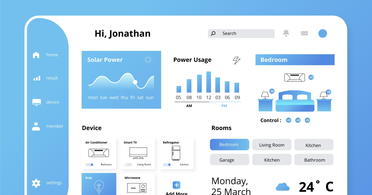
Headers are the first UI/UX design element users come across when entering a design. It is a simple container designed to be placed at the top of every view page and reacts depending on the scroll view elements. Headers provide information regarding branding, navigation, search, and can also offer access to app actions like notifications and settings. Headers can contain titles and actions related to the current screen.
The layout of webpages and apps has a direct correlation with how well they are going to perform among users. The user interface needs to be intuitive, accessible, and include all the useful information visitors seek out. Think about it this way - you are scrolling through a page that seems to be endless. We need to pay attention to the colors, the icons, the typography, and any other element that might cause our users to lose interest or even have a bad user experience.
Headers are encountered in many digital products and carry a lot of important information related to the product, such as the logo, CTA, search field, subscription field, and basic information, such as the phone number or email address.
- Keep the design consistent.
The headers help maintain the consistency of the design. In UI/UX design, to create a good user experience, you need to keep the design consistent and easy to scroll through. As it creates a consistent visual experience for users across different pages and interactions.
Headers have the quality of providing additional information that can be useful for users. One of the most common instances in which headers come in handy is when we want to assist users with links that are related to the experience on the website.
- At the beginning of the Page.
UI design headers can help us establish a visual order in our websites, and they should be considered during the design process. Users are already used to and anticipate that a website will have a header at the bottom of the page. This is why integrating a header at the end of a page can ensure balance in the visual aspect.
- To include links and dropdowns for easier navigation and a better user experience.
One of the cases in which it is advisable to implement a header is for call-to-action and dropdown buttons. Due to its placement at the beginning of the page, advertising the main products will likely be easier to notice and create a better user experience.
Although adding links to the main products in the web page in the header would be counterproductive, there are means of using this UI design element for advertising purposes. For example, a signup form link could be inserted in a header in order to reach out to new leads more easily. In this way, we also avoid pushing an aggressive type of publicity that can often ruin the user experience.
Creating headers can become easier than ever with the help of a design system. With a design system, we automatically eliminate this dead time. Creating a component takes time – not only for designing but also for research and feedback. However, clearer guidelines mean less research and fewer rounds of feedback, which means fewer revisions. With a design system, it also means fewer risks of error.
We at uinkits understand the importance of inputs in great user experiences and creating amazing UI designs. That’s why we’ve developed a Figma UI Kit with design components that include these essential UI elements that enable you to design intuitive and user-friendly interfaces effortlessly.
“You press the button, we do the rest,” – Kodak.
Inspired by this iconic tagline from Kodak, we believe in simplifying the design process for you. Our Figma UI Kit, uinkits, is a complete design system with UI components that allows you, as a UI UX designer, to create your products as quickly as pressing a button.
Our design system includes components, icons, variables, cards, buttons, and everything you need for your design process. All you have to do is take your UI design component needed, and you’re ready to use it in your designs!


