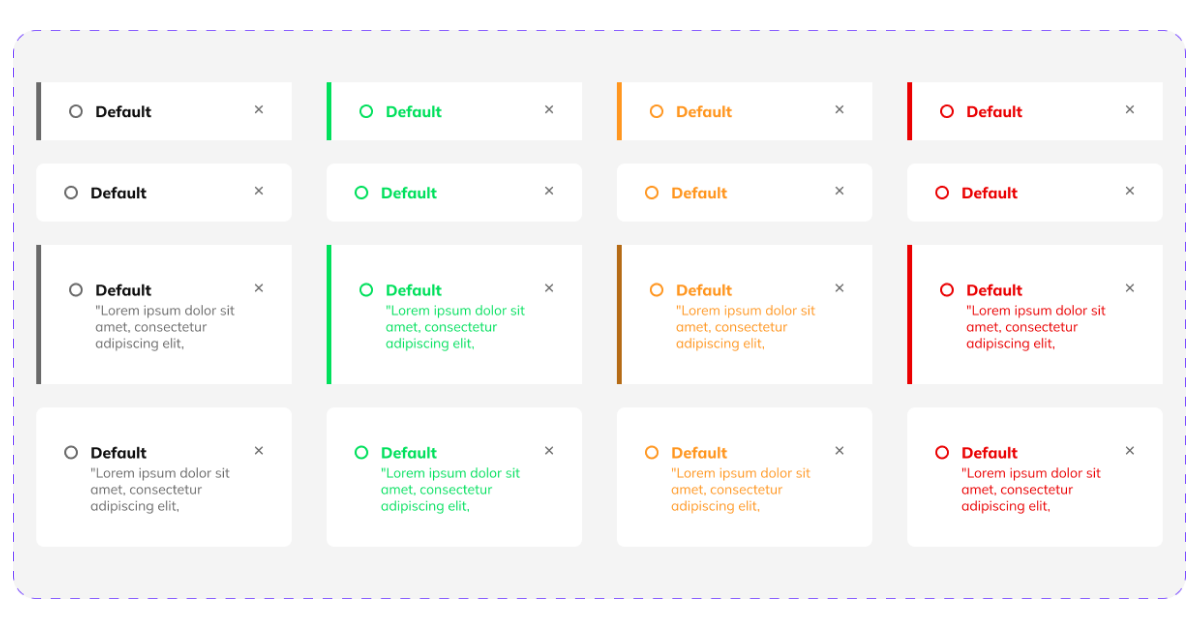
A UI UX design needs to pay attention to all small details, including toast notifications. Letting your users know the digital platform’s feedback is a mandatory action that any UI UX design needs to implement.
A UI UX design needs to pay attention to all small details, including toast notifications. Letting your users know the digital platform’s feedback is a mandatory action that any UI UX design needs to implement.
UI UX design has come a long way, and we need to acknowledge that once our society and technology emerged, the need for intuitive digital platforms and user interfaces was more acute than ever. Having a UI UX design that speaks for itself is what all designers should focus on. And, to accomplish this task, we need to choose the right elements and see how suitable they are for our audience in order to create an intuitive design. Even more so, UI toasts are an important design element we need to pay attention to and find out how we can use them correctly.
Toasts can carry up to one action. Their purpose is to display short, temporary notifications in order to help users navigate the digital platform more efficiently. This UI element is meant to appear without disrupting the users from its primary actions. It can help the user know when an action has ended successfully, or it can showcase that an action did not occur as expected.
Think about the toast notification that pops up when you have copied something to your clipboard, or about the toast notification that you see when making a screenshot. A toast is a UI element that acts as a customizable feedback message that appears on our digital platforms.
Upgrade to UI PRO version of Uinkits Systems to unlock 23.000 UI components.
Use the code "FEB40"
To get an even more in-depth understanding of the use of toasts in the user interface, let’s consider the next situation. You are creating an important post on your Instagram account, announcing a new product that is about to launch. When you finally decide what to write in the description of your post and hit the share button, you are left there wondering whether or not your post is online.
But this situation would not have been the case if a toast notification had appeared. When a toast pops up on the screen, with the purpose of informing us that we have successfully uploaded the content to the platform, we are no longer in a stressful and inconvenient situation.
We at uinkits understand the importance of great user experiences and creating amazing UI designs. That’s why we’ve developed a Figma UI Kit with design components that include these essential UI elements that enable you to design intuitive and user-friendly interfaces effortlessly.
“You press the button, we do the rest.” – Kodak.
Inspired by this iconic tagline from Kodak, we believe in simplifying the design process for you. Our Figma UI Kit, uinkits, is a complete design system with UI components that allows you, as a UI UX designer, to create your products as quickly as pressing a button.
Our design system includes UI components, icons, variables, cards, buttons and everything you need for your design process. All you have to do is take your UI design component needed, and you’re ready to use it in your designs!
Discover a handpicked selection of UI/UX articles that offer valuable insights, best practices, and the latest trends in digital design.

At uinkits, we're all about the awesome possibilities of design. Join us now and let's shape the future together!