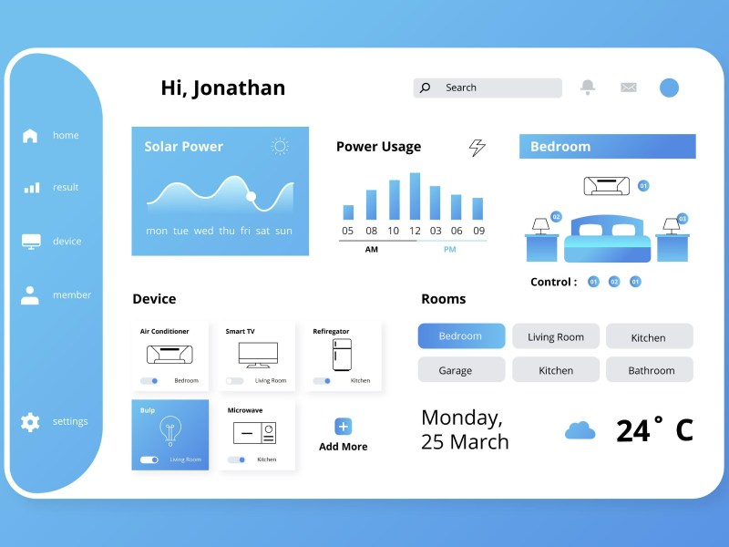
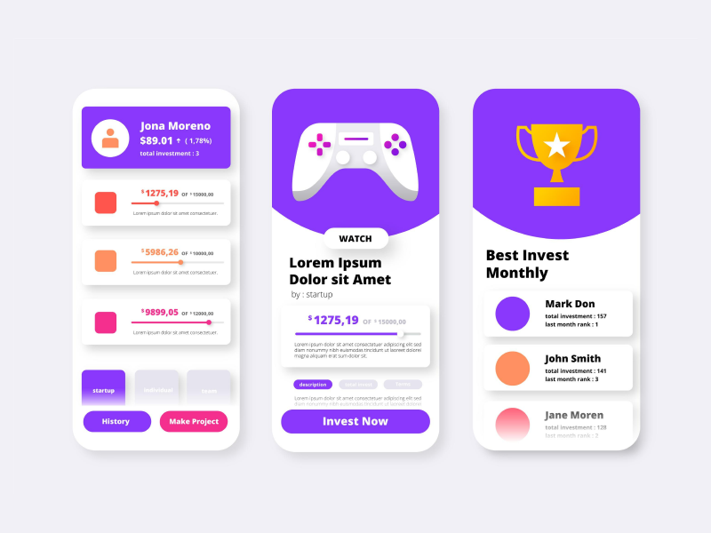
It’s important to understand that colors have a significant over the user experience because most of the time potential customers or regular users are attracted to visually appealing things.
Colors have also a meaning because is able to communicate with the users at the same time on conscious and subconscious levels. Keep in mind that a good website that has a lot of traffic needs to have a color scheme to generate interest and other emotions.
It’s important to understand that all colors are made first based on mixing the primary colors, blue, red, and yellow in various quantities. By mixing two of the three primary colors, you are able to create a secondary color. After that, you can also mix one of the secondary colors with a primary color in order to reveal the tertiary color.
So, let’s reveal all the colors from the color wheel.
- Primary colors: red, blue, and yellow
- Secondary colors: orange, purple, and green
- Tertiary colors: blue-green, red-orange, and, yellow-green
Most designers think that choosing the perfect color combination for the project is a hard task that requires time and effort. But, now we should discredit this myth because based on the color wheel and some advice, everyone will be able to choose the right color combos that can be integrated into every design.
Complementary colors
Complementary colors represent the two colors that sit on the color wheel on opposite sides, such as yellow and violet. These two colors are able to work together in a project because they complement each other and can be used with one as the main color and the other as an accent color of the design.
Triadic colors
This color combination included three colors that are placed at an equal distance from each other, making a shape similar to a triangle on the color wheel. Let’s take the example of violet, green and orange. These three colors are placed on the color wheel at the same distance.
Analogous colors
Analogous colors are made from the combination of 2 up to 5 colors that are placed next to each other in the color wheel. Here we can take the example of Yellow, Yellow-orange, Orange, Red-Orange, and Red. These 5 colors are placed right next to each other in the color wheel and based on them designers can elevate their projects and attract more users.
Tetradic
This color combination is made based on 4 colors as follows: one color must be a primary color, two of them must be complementary and the other must be picked to be an accent color.
Popular themes such as minimalist, bold color, or nature-inspired palettes are now the three main aesthetics used when designing a product. It’s important to look for the color combination that works best for your design even if it's a new brand identity, product packaging, or landing page, to ensure that the final product will have balance, contrast, and harmony between elements.
Let’s review some of the next complementary colors that are worth to be used in projects:
1. Blue and Orange
These two aesthetic colors are able to provide a contrast while maintaining the harmony of the design. Here, the color blue symbolizes professionalism and trust, which makes it an ideal choice for designers who have projects in corporate or tech designs. On the other side, Orange evokes at the same time energy and excitement, managing to create a dynamic pattern. Put together, these two aesthetic colors are perfect to be integrated into UI design for sports branding or in ads that have as the target audience younger users.
2. Purple and Yellow
The purple color in this combo means royalty and creativity while the yellow color evokes optimism and joy. This color combination is the right choice for cosmetic packaging, and event design because it is able to create at the same time a balanced and bold vibe. For 2025, feel free to use different color variations such as lavender with mustard or even deep plump with gold for a unique product.
3. Teal and Coral
This color combo is inspired by nature and it’s perfect for designers who are looking to evoke a summer vibe with oceanic and sunset vibes. These two complementary aesthetic colors are the right choice for wellness brands or companies with tropical-themed designs. While the color teal evokes stability and calm, coral brings vibrancy.
4. Red and Green
Used most of the time in festive designs, this color combination is naturally associated with holidays. While this pair is always a good one to use in your projects, in 2025, designers must explore other softer shades that are made from these two such as coral and sage, or brighter tones such as lime and scarlet. Feel free to adjust the balances to find the perfect color combos for your projects.
We at uinkits understand the importance of great user experiences and creating amazing UI designs. That’s why we’ve developed a Figma UI Kit with design components that include these essential UI elements that enable you to design intuitive and user-friendly interfaces effortlessly.
“You press the button, we do the rest.” – Kodak.
Inspired by this iconic tagline from Kodak, we believe in simplifying the design process for you. Our Figma UI Kit, uinkits, is a complete design system with UI components that allows you, as a UI UX designer, to create your products as quickly as pressing a button.
Our design system includes UI components, icons, variables, cards, buttons and everything you need for your design process. All you have to do is take your UI design component needed, and you’re ready to use it in your designs!


