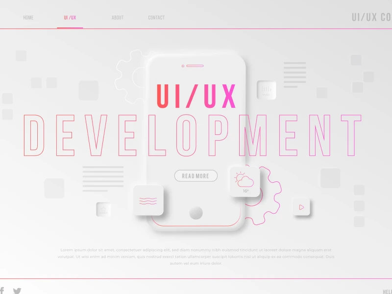
Navigation tabs represent UI controls that are specially designed to organize the content of a webpage in multiple panels, so users will see by clicking on them, one panel at a time. Navigation tabs are an essential part of any web or mobile app design because they offer the best way to navigate and analyze the content from different pages or sections.
They should not be judged just by their size, because even though they are small compared with other elements in the UI design, have usually a much bigger role in user experiences. This way, by clicking on a navigation window, users will be able to anticipate what content they are about to see in different tab UI designs.
It’s important that all UI/UX designers know and use various practices in order to design an intuitive and effective website or mobile app for users. Let’s review some of the best practices that are crucial in any UI/UX design.
Implement The White Space As A Divider
In the overall website or app design and also for nav tabs, the white space is probably the most important aspect of design, because it ensures the visual attractiveness of the project. Usually, the horizontal tabs UI design uses various vertical lines to divide the categories can look out of place and sometimes cluttered, when the design has multiple groups.
Make Sure That All The Nav Tabs UI Looks The Same
It’s important in every nav tab design to remain consistent with the same look in order to create a visually appealing project that will engage users. If the nav tab design is not consistent throughout all horizontal tabs' UI design, the final look will create visual noise.
So, make sure that the nav tab UI design has the same size, color, font style, and even background to maintain continuity in categories.
Check If The Unselected Tabs UI Can Still Be Visible To Users
All the unselected nav tabs UI need to be different from the already active nav tab, but they shouldn’t be covered or appear inaccessible to users. If the other tab UI design looks a little bit too faint, users will most certainly think that can’t be clicked or accessed in the webpage or app design.
It’s important to find the right balance between the active and inactive tabs, to make sure that the active tab UI design stands out and is highlighted properly and the other inactive tabs remain visible in the design.
Limit The Horizontal Tabs UI Design To Just A Single Row
When considering designing a horizontal tab UI design, all designers should know that just the important categories must be displayed. If the design has multiple rows in the navigation tab, the website will probably give the impression that the second row represents the less important subcategories.
Make sure that in order to maintain an efficient user experience, it’s crucial to stick to just one important row of categories. This way users will know that the subject needs more attention, and will focus more on them.
Choose Just One Label: Text Or Icons
All the navigation tabs must have just a single label to make sure that the overall design is seamless throughout the entire website or app. When choosing the text label, try to use meaningful and short names, to make sure that will be visible to users. Also, the name must the related to the content that is shown in the tab UI design window.
On the other side, all the icons must be easily recognizable while being at the same time related to the content. For a higher understanding, try to use if possible, both text and icons to give a more attractive look that will surely engage the users.
So, as you can see navigation tabs UI play a crucial role in improving the user experience because they are able to organize the content in an intuitive way. It’s important to follow the best practices such as maintaining consistency in the design, using white space wisely, and others because with these practices, UI/UX designers can create user-friendly navigation systems.
Keep in mind that a well-designed navigation tab UI design not only ensures a seamless website or app interaction but also it contributes to the overall satisfaction of the user.
We at uinkits understand the importance of great user experiences and creating amazing UI designs. That’s why we’ve developed a Figma UI Kit with design components that include these essential UI elements that enable you to design intuitive and user-friendly interfaces effortlessly.
“You press the button, we do the rest.” – Kodak.
Inspired by this iconic tagline from Kodak, we believe in simplifying the design process for you. Our Figma UI Kit, uinkits, is a complete design system with UI components that allows you, as a UI UX designer, to create your products as quickly as pressing a button.
Our design system includes UI components, icons, variables, cards, buttons and everything you need for your design process. All you have to do is take your UI design component needed, and you’re ready to use it in your designs!


