Typography plays a key role in UI design because it directly affects how people read and interact with digital products.
The fonts used in an interface influence readability, help create a clear visual hierarchy, and communicate the personality of a brand.
Choosing the right combination of fonts is therefore an important design decision. Font pairing is not only about making a layout look attractive. It is also about creating balance and contrast so that the content is easy to scan and understand.
It’s important to mention that typography has a practical role in every website and app interface because it helps to organize information and makes the whole content easier to understand for visitors and users.
When fonts are paired correctly, they create a clear visual hierarchy that shows users what to read first and what is less important.
Good font choices also improve the scannability of content, which is essential for digital interfaces where people usually skim rather than read every word.
Even more so, font pairing supports brand identity, and the style of the fonts can communicate whether a product feels modern, playful, professional, or minimal. At the same time, typography guides user attention to important elements such as headings, navigation items, buttons, and labels.
Most interfaces follow a simple structure that includes a heading font, a body text font, and sometimes an accent font for UI elements.
Almost all designers are following a couple of simple principles when designing an interface. These font guidelines are actively helping them to create typography that looks balanced and is really easy to read for users.
- Contrast: the most important rule from them all, because the font designers combine should look different to be easier for users to differentiate between elements. A common example is pairing a serif font with a sans-serif font. The visual difference helps users recognize headings, body text, and other sections more easily.
- Complementarity: another important aspect because fonts are designed to support each other, not compete for the user’s attention, so a more expressive font can work well for headlines, while a clean and neutral font can be used for body text.
Consistency is the aspect that keeps the entire design unified, because typography should feel to users like a part of the same system in the whole interface. When designers choose to use too many fonts, this choice can create a lot more confusion and visual noise, and eventually make the layout feel disorganized.
There are many strategies that can be used when pairing fonts in user interface design. Using these approaches can help create interfaces that are both attractive and easy to read.
- Serif + Sans Serif: This is the most classic combination because it can balance personality with readability. Usually, a sans-serif font is typically used to give them character, while a clean sans-serif font is used for body text to ensure clarity.
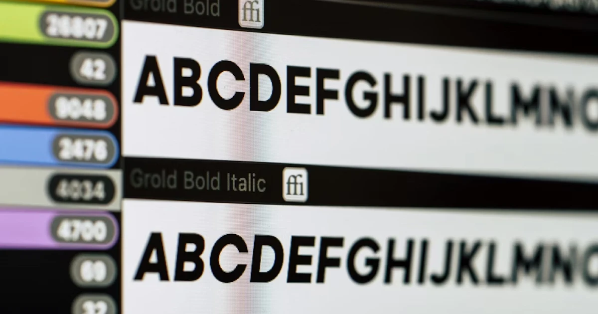
- Same Font But With Different Weights: This is a common practice in modern UI design because it is much simpler for a designer to just use a single font with different weights, such as regular, bold, or medium. This approach helps to create a hierarchy without introducing multiple fonts, keeping the interface simple and cohesive.
Even small typography mistakes can hurt the user experience. One common error is using too many fonts, which makes an interface look cluttered and confusing. Pairing fonts that are too similar is another problem, as it can make headings and body text hard to distinguish.
It’s important to understand that it is not always a good choice to use decorative fonts for body text because it can reduce readability, especially on smaller screens such as mobile phones.
Ignoring mobile readability can make content difficult to scan on phones and tablets. Finally, forgetting accessibility by choosing hard-to-read fonts or poor contrast can prevent some users from navigating the interface comfortably.