Do you want to grow your business smoothly, without having to “reinvent the wheel” every time?
For startups, where speed and clarity are crucial, a solid design system can be the difference between chaos and efficiency. It helps small teams move faster, stay consistent, and focus on innovation instead of constantly focusing on fixing inconsistencies.
A design system is an organized set of reusable components, built around well-defined rules. What does it do? Simply put, it helps teams create consistent user interfaces. It goes beyond a simple style guide, including not just visual elements, but also design principles, interaction patterns, and tools.
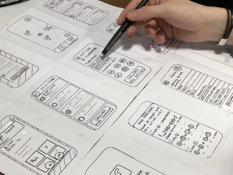
Think of it like a recipe book with clear ingredients and step-by-step instructions for the smoothest and quickest UI design. Any design system relies on a component library, a solid collection of reusable “ingredients” like buttons, cards, forms, modals, and more. These elements are functional, tested, and aesthetically consistent.
To respond to the needs of an expanding business and a product that evolves, this library should be vigorous and coherently organized. Otherwise, you’ll lose precious time rebuilding the same components, fixing inconsistencies, and struggling to keep up with the changes. This is where Figma resources come in handy!
Developing a scalable design system is no simple task. But with a bit of shared knowledge and some time invested, it’s as good as done.
1. Setting the Scene
This step involves identifying core principles, key components, and determining the infrastructure.
- Start by defining the most important values of your brand. Ensure that these principles are integrated into your design system in every element.
- Everything you need to include, from buttons to navigation menus, should be precisely identified.
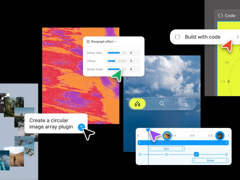
- Choose and set up the right design tools to support your design system and make sure the whole team can easily access them. Figma resources are a reliable option for you to consider.
2. The building phase
Put on a safety helmet and let’s create some high-quality components for our Figma design system! In this step, keep an eye on both the aesthetics and functionality of the elements. Design each one to be flexible. This way, it will make customization simple.
Even more so, good documentation keeps your design system usable and scalable. Lay out clear instructions, show specifications, and share code snippets. Keep it easy to find and up to date!
3. The scaling phase
As your startup grows, your Figma design system needs to keep up. This means adding new components, refreshing guidelines, and staying flexible.
Expand your component library with patterns and elements tailored to new products or use cases. Keep everything documented and aligned. At the same time, update your guidelines regularly to reflect user feedback and new best practices.
Most importantly, design with flexibility in mind. Build modular components and adaptable rules so your system stays consistent, but never rigid.
Atomic Design is an approach to creating design systems by breaking interfaces into small, reusable parts. Developed by Brad Frost, this method is inspired by chemistry’s concept of building complex structures from tiny elements. The process starts with basic UI elements and combines them step by step into larger, functional components. They follow five stages:
- Atoms - basic elements of design, such as input fields, buttons, labels, typography or colors. They are “unbreakable” components from the perspective of Atomic Design
- Molecules. You guessed it! - groups of atoms. A molecule could be a button (atom) combined with an icon (atom). For example, a “Download” button with a download icon next to the text forms a reusable button molecule.
- Organisms are groups of molecules (and sometimes atoms) working together as a distinct section of the interface. For example, a website header might combine a logo (atom), navigation menu(molecule), and search form (molecule) into a single, reusable organism that serves a clear purpose
- Templates set up the basic layout of a page by arranging organisms into a clear structure or grid. They act as blueprints that show where things go, focusing on the overall design framework, not the actual content.
- Pages bring templates to life by adding text, images, and data. This way, you can have a clear picture of how the design will perform in reality.
If you want your startup to grow without constant redesigns and inconsistencies, a solid design system and Figma resources are essential. By setting clear foundations, building reusable components, and keeping everything flexible, you make sure your team can work faster and stay aligned.
A design system isn’t built once and forgotten. It needs regular updates and improvements. But with the right approach, it will save you time and effort in the long run.
Investing in a scalable Figma design system now means fewer problems and smoother growth later!
We at uinkits understand the importance of great user experiences and creating amazing UI designs. That’s why we’ve developed a Figma UI Kit with design components that include these essential UI elements that enable you to design intuitive and user-friendly interfaces effortlessly.
“You press the button, we do the rest.” – Kodak.
Inspired by this iconic tagline from Kodak, we believe in simplifying the design process for you. Our Figma UI Kit, uinkits, is a complete design system with UI components that allows you, as a UI UX designer, to create your products as quickly as pressing a button.
Our design system includes UI components, icons, variables, cards, buttons and everything you need for your design process. All you have to do is take your UI design component needed, and you’re ready to use it in your designs!


