When thinking about minimalism, this isn’t necessarily focused on removing elements, but it's more about removing the unnecessary elements that make a design feel cluttered.
In UI design, minimalism means focusing only on what truly matters. It is about clarity, purpose, and intentional design choices. Over the past decade, minimal interfaces have become increasingly popular, especially with the rise of mobile-first design, faster digital experiences, and users who expect simplicity.
Clean layouts, generous white space, and clear typography often feel modern and easy to use.
However, minimal does not mean empty. Removing too much can create confusion instead of clarity.
When applied thoughtfully, minimalism can dramatically improve usability. When applied blindly, it can reduce clarity and hurt conversions.
What Minimalism in UI Design Means
Keep in mind that just before deciding if minimalism is a good or bad approach, we just need to understand what this approach really means in UI/UX design.
Firstly, a minimalist approach in UI/UX design is not implemented to make interfaces look plain, but it’s focused on creating functionality before applying decorations. This is implemented to make sure that every element has a clear purpose, and it’s not just for looking good.
A minimal interface relies on strong visual hierarchy, a limited color palette, generous white space, and clear, readable typography. Interactions are intentional and meaningful, not added just for visual effect.
There are some design movements like Bauhaus and Swiss Style that are focused on promoting a function-first philosophy, highlighting the importance of a clear structure and grid systems.
When thinking about minimalism, we must focus on intentional reduction, because a visual trend will only look modern and trendy without having a real user experience.
When Minimalism Actually Works
- When the content is the main attraction of the website
Minimalism works for those websites when the content draws the user’s attention without needing additional elements. This applies to portfolios, photography websites, or even SaaS dashboards where the data is crucial.
So, when the message is simple and focused, having a clean interface is often better to make sure that users can concentrate on what matters.
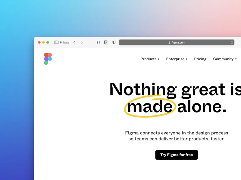
You can see this approach on Apple product pages or Stripe landing pages. The layouts are structured, spacious, and free of unnecessary distractions.
This works because it reduces cognitive load. Users do not have to process competing elements. Their attention is guided toward one clear message and one primary action at a time.
40% OFF
Only this February
Upgrade to UI PRO version of Uinkits Systems to unlock 23.000 UI components.
Use the code "FEB40"
- When The User’s Goal Is Very Clear
Minimalism is also effective when users already know what they want. If the goal is obvious, the interface does not need to explain too much. It simply needs to remove friction.
Let’s take the example of the Google homepage. These users visit the website with a clear intention: to search for something, right?
Here, the simplicity supports just a single action, and in Google’s case, to search for something they are interested in.
- In Mobile Contexts, When High-Performance Is Needed
Minimal design is especially powerful in mobile and performance-driven environments. Smaller screens demand clarity and prioritization. Too many elements create visual noise and make scanning difficult.
Creating a minimal interface will surely improve load times, simplify layouts, and support quick decision-making. It aligns well with principles like Hick’s Law, which states that more choices increase decision time, and with the idea of reducing cognitive load.
But When The Minimalistic Approach Fails?
- When it comes to removing clarity
Minimalism fails when it starts removing elements that users actually need. Probably the most common mistake is when a website hides the navigation by removing labels and relying only on icons to guide users.
This is where minimalism fails, because when it’s applied in all categories of UI/UX design, it tends to be ultimately useless. In UI/UX design, this phenomenon is called mystery meat navigation, where users have to hover or click just to understand what something does.
One example is the overuse of hamburger menus in desktop interfaces. While this pattern makes sense on mobile, hiding key navigation on large screens can reduce visibility and increase friction.
- When The Brand Personality Disappears
It’s essential to recognize that not every brand benefits from a minimalist approach in design. Some brands need warmth, energy, and even emotions in order to connect with their target audience.
Over-minimalism can make an interface feel cold, generic, and interchangeable with countless other products.
When minimalism removes personality, it can weaken brand identity and make the experience less memorable.
Minimalism in UI design can be very powerful when it is applied intentionally. Every element should serve a clear purpose, and every interaction should guide the user effectively.
Keep in mind that when minimalism is used blindly only as a trend, it can significantly reduce the website's clarity, hide important features, and weaken the overall user experience.
The best minimal interface is not the one with the fewest elements, but the one that creates the least friction for users and makes every interaction simple and intuitive.
uinkits – Our Figma UI Kit
We at uinkits understand the importance of inputs in great user experiences and creating amazing UI designs. That’s why we’ve developed a Figma UI Kit with design components that include these essential UI elements that enable you to design intuitive and user-friendly interfaces effortlessly.
“You press the button, we do the rest,” – Kodak.
Inspired by this iconic tagline from Kodak, we believe in simplifying the design process for you. Our Figma UI Kit, uinkits, is a complete design system with UI components that allows you, as a UI UX designer, to create your products as quickly as pressing a button.
Our design system includes components, icons, variables, cards, buttons, and everything you need for your design process. All you have to do is take your UI design component needed, and you’re ready to use it in your designs!
By
Cristi Fonea
•
February 25, 2026