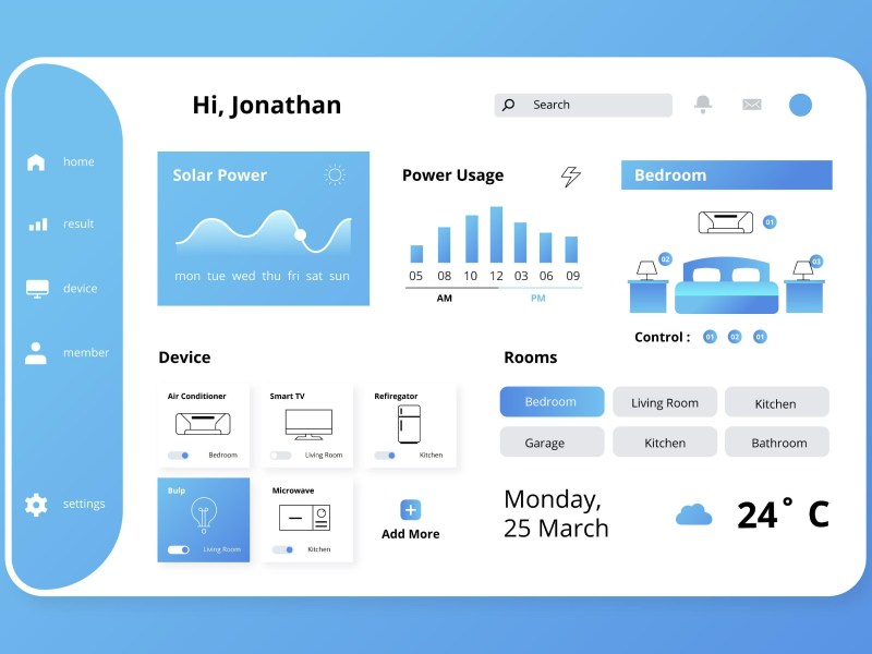
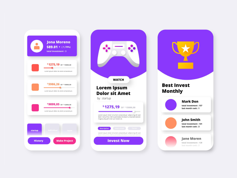
Color is the most important element in a user interface design due to its ability to influence the overall mood, functionality, and even the usability of the product. When used effectively, color and the color palette might guide users through a product that has visual appeal.
The primary purpose of the color palette in UI design may be to help users understand and differentiate all the UI elements from the webpage better. For example, using a different color for buttons and UI interactive elements will improve the user experience and also help the overall interaction with the website. So, choosing different colors is important to highlight the important elements that users must focus on.
The color palette in UI design represents the selected range of colors used consistently across the user interface design. It can establish the visual identity of the design and enhance the functionality and aesthetics of the website or app.
Why does the color palette matter for the UI design?
The color palette plays an important role in user interface design because it can shape the way users interact and recognize a product. The color palette is more than just an aesthetic idea; it can evoke different emotions and influence decision-making while enhancing the user experience.
It is commonly known that colors trigger some psychological responses and can influence how users feel when interacting with the website or the app. For example, the color blue offers trust and a peaceful feeling, and that’s why you will often see that financial institutions and tech companies use blue in their branding. The color red can stimulate urgency or excitement, which is why many apps and websites use the color red for call-to-action buttons.
In fact, it was proven that color influences the purchase decision of 85% of people when online shopping. At the same time, color also has the power to increase brand awareness by around 80%.
- For Usability and Accessibility
The right combination of colors can significantly impact overall usability. Colors can shift the user's attention and make key elements stand out, such as buttons, notifications, or navigation menus. However, they can also play a crucial role in readability because color can ensure the right contrast between the text and the background.
Every UI designer needs to remember that designing with accessibility represents the most important thing for a project because, for example, some users may suffer from different visual disorders, such as colorblindness, where they can experience issues with specific color combinations.
- For Brand Identity and Consistency
The color palette is also important for the overall brand identity. A website or app with a consistent color palette in the UI design will have a more professional and solid visual appeal. It’s important to make sure that the color palette is evenly distributed across all the elements so that later, more users will be able to associate it with your brand.
In creating the perfect UI color palette for a design, any UI/UX designer must stay updated with the latest design trends and understand the impact that colors can have on user behavior.
Let’s review some of the best practices that any UI designer must follow to create the right color palette:
1. Choose The Primary, Secondary, And Accent Colors
In the UI design, the primary colors dominate across the entire screen and guide users toward the key points. Usually, this color is associated with the brand, like red for YouTube or blue for Facebook.
After choosing the primary colors, the secondary and accent colors will highlight and differentiate elements in a design.
Any UI/UX designer can use the WCAG ( Web Content Accessibility Guidelines), a website that helps designers determine the color contrast ratio between the highlight color and background color to ensure harmony. It is recommended to have a contrast ratio of 4.5:1 for normal text and 3:1 for large text.
2. Follow the 60-30-10 rule
The 60-30-10 rule represents a guideline that helps designers balance the visual appeal of the website or app. So, in this rule, every UI design must have :
- 60% of the space is covered with the primary color
- 30% covered with the secondary color
- 10% covered with the accent color
For example, the primary color in a web UI design is often used for the background or large elements such as the header. After this, the secondary color covers the captions, subheadings, or other smaller elements. Lastly, the accent color is used only for call-to-action buttons or to highlight important information.
3. Understand the target audience
When choosing the color palette, it is important to analyze and understand the audience. Consider the audience demographics, the final purpose of the product, and the emotions that you want to evoke with the color combination.
Another thing to consider is conducting user research. By doing that, every UI UX designer will learn more about their target audience and what could make them purchase the product.
4. Consider using photos to create the color palette
For example, nature and some elements from architecture can be a perfect inspiration source for a unique design on a website or app.
There are many online tools and plugins that help designers generate the perfect color palette from one image.
The first step is to choose a relevant inspirational photo to include in the color palette. Then, use various tools such as Adobe Color, Coolors, or Canva to generate the final color palette for your UI design.
Once you have the desired combination, test it in different parts of the user interface, such as the background, buttons, or text, to ensure that the website's readability is as high as it can be and that the colors work together in harmony.
5. Make sure to use a naming convention
It’s important to use a naming convention for the color palette in UI design to ensure that developers and designers use the right colors consistently.
For example, name the colors based on their intended use in the UI design. This will ensure that every team member understands where each color will be applied. It’s important to name the colors with “primary,” “secondary,” and “accent,” followed by specific uses such as “primary button” or “accent-link.”
Creating the best color palette for your UI design is also a science and an art because it requires a deep understanding of color theory, brand identity, and the way colors can influence users’ emotions and actions.
Keep in mind that it’s crucial to select a primary, secondary, and accent color wisely to ensure that they work in harmony and are also functional. Every UI UX designer can also use different tools and inspiration from the real world to make the creation process easier.
Don’t be afraid to test and experiment with different best practices and colors with real users and edit your choices until you find the perfect color palette for your UI project.
We at uinkits understand the importance of great user experiences and creating amazing UI designs. That’s why we’ve developed a Figma UI Kit with design components that include these essential UI elements that enable you to design intuitive and user-friendly interfaces effortlessly.
“You press the button, we do the rest.” – Kodak.
Inspired by this iconic tagline from Kodak, we believe in simplifying the design process for you. Our Figma UI Kit, uinkits, is a complete design system with UI components that allows you, as a UI UX designer, to create your products as quickly as pressing a button.
Our design system includes UI components, icons, variables, cards, buttons and everything you need for your design process. All you have to do is take your UI design component needed, and you’re ready to use it in your designs!


