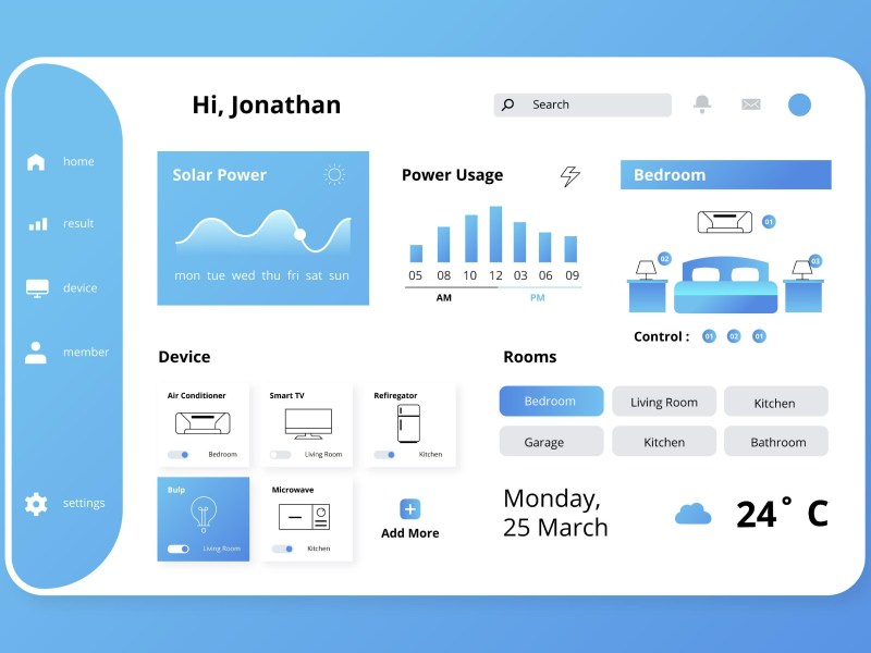
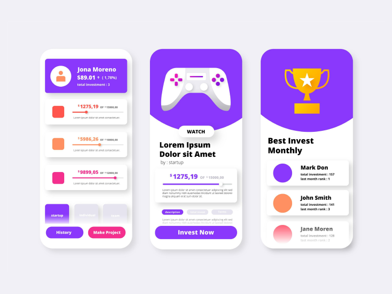
Discover the toggle switch UI design element, from how it translates into the user interface of apps and websites, to useful UI UX designer tips on how to create them.
When we are looking to better understand the ins and outs of the perplexing tech world, we should not look further than those around us. After all, every aspect of our computers, phones, and smartwatches draws inspiration from the real world to an extent.
Based on the same principle, we can view the application of toggle switches in the real world. There are so many devices that act upon an on-and-off switch. When we go to wash our clothes in the washing machine, we encounter one. When we want to turn the lights on in a room, we encounter another type of on-and-off switch. However, today we will focus on the relationship between UI UX design and toggle switches, so we learn how to apply them to our own app and web designs.
What are Toggle Switches in UI Design?
This UI design element acts as an on-and-off switch. A UI UX designer should add a toggle to the web design when they want a simple answer, usually yes/no, show/hide, or on/off. Their main advantage is that they simplify otherwise time-consuming user processes, like navigating and opening different pages.
It is also very intuitive, and it should generally be adopted to manipulate the state of a single feature. Toggles are useful for situations where our users would express certain preferences. For example, we could add an on/off toggle to the Reminders entry, letting visitors choose whether to receive reminders.
Toggle switches are oftentimes compared to radio buttons. However, the big difference between these two design elements is the number of options they provide to the users. While radio buttons can have two or more options, toggle switches can exclusively present two options at a time.
Only this December
Upgrade to UI PRO version of Uinkits Systems to unlock 23.000 UI components.
Use the code "DEC40"
When to use Toggle Switches in UI Design
As UI UX designers, it is important to be accustomed to the situations in which toggle switches should be integrated into a design.
- Independent items. Toggle switches can be used when the item can be controlled independently
- Changing Settings. By the implementation of toggle switches to the user interface, we offer users one of the easiest and most intuitive means through which they can control and customize settings.
- Yes and No. In many cases, toggle switches are used to adjust and choose between two options, yes/no. It is a much faster way of answering yes and no questions, which can positively affect user experience.
- Activating and Deactivating. This element is used to immediately activate or deactivate certain options.
- Navigation Menus. As UI design elements, toggle switches can be used to highlight other aspects of the user interface. In this way, toggle switches can also be used to control the visibility of navigation menus.
How to use Toggle Switches in UI Design
- Visibility. As UI UX designers, we are fully aware that UI elements need to be easily distinguishable, while also maintaining visual coherence. Make the which easy to reach and observe.
- Default Value. During the design process of toggle switches, it is important to assign them a pre-selected default state - which is either on or off.
- Labels. If we pick the right labels, we increase the chances that our users will understand the toggle switches easier. Generally speaking, the labels for toggles should be kept brief and short, as we do not have a lot of space allocated for them. For example, instead of labeling a toggle switch with Turn on Wi-Fi, we can simply name it Wi-Fi.
- Clarity. Toggle switches are dual UI design elements. Because both states they can take on are relevant, toggle switches must offer clear on-off states for the users.
- Placement. The placement of toggle switches, as well as their labels, is also an important aspect that influences the readability of the user interface. The labels of the switches are left aligned. This can help the users understand the meaning faster and at the same time left-aligned labels will comply with the way users interpret and read content.
- Colors. Color theory is one of the most prevalent aspects in UI UX design. We should use colors to divide the two states of the toggle. Another helpful strategy would be to highlight and use accent colors when the toggle is switched on and use neutral colors when the switch is off.
- Visual Coherence. Psychology showed us that people are driven and attracted by familiarity, rather than new things. Toggle switches need to be adapted to the toggle design with the rest of the design. Let’s take a well-known example - the iPhone user interface. Apple’s toggles are minimalistic, straightforward, and sleek which matches the overall aesthetic of the brand.
Actions. As the main purpose of a toggle switch is to influence the state of the user interface by determining an action, this should also be put into place. To be more exact, whenever a user clicks on a toggle switch, an action has to be immediately triggered. For example, when we slide the dark mode Apple feature, the user interface theme immediately switches to the dark color theme.
uinkits – Our Figma UI Kit
We at uinkits understand the importance of inputs in great user experiences and creating amazing UI designs. That’s why we’ve developed a Figma UI Kit with design components that include these essential UI elements that enable you to design intuitive and user-friendly interfaces effortlessly.
“You press the button, we do the rest,” – Kodak.
Inspired by this iconic tagline from Kodak, we believe in simplifying the design process for you. Our Figma UI Kit, uinkits, is a complete design system with UI components that allows you, as a UI UX designer, to create your products as quickly as pressing a button.
Our design system components, including variables, cards, buttons and everything you need for your design process. All you have to do is take your UI design component needed, and you’re ready to use it in your designs!


