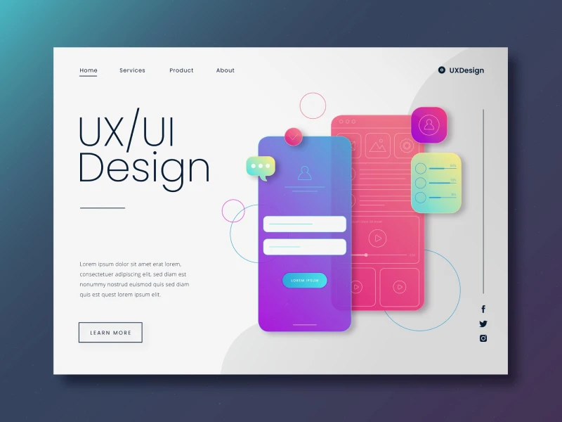
The best microinteractions are the ones that go unnoticed but serve a great purpose. Every interface can be more responsive using small loading indicators, checkmarks for completed actions, or color-changing buttons.
All these small moments that happen in a website or an app are called microinteractions. It’s true that animations were once used only to make the interfaces more engaging, but right now, the latest UX trends focus on a more purposeful approach.
Okay, but we know microinteractions already; everyone who has interacted with a design before knows what microinteractions are. So, do we need Microinteractions 2.0?
What makes a microinteraction 2.0?
It’s important to understand that not all microinteractions are created with the same purpose, because at the beginning of the UI UX design process, animations were used to make an interface more dynamic and visually appealing.
Microinteractions 2.0 take a more intentional approach. So, the purpose of these is not only to move an element because it is possible; it is to help users understand what to do next in a design. Sometimes, a subtle transition can show that a page is actively changing, or a loading animation can reduce uncertainty.
So, the animation should communicate something to users, not just move an element in a design to look good.
Why Subtle Animations Actually Matter
Let’s be honest, microinteractions can instantly improve any digital experience, but first, they are useful because users need constant feedback and reassurance while navigating a website.
Maybe the simplest example is button feedback, because it slightly changes when it is clicked to confirm that the action was, in fact, registered. The simplest change can be sometimes the most effective one. After submitting a form, replacing the button label with a loading state can also prevent users from clicking it multiple times.
Another important use is the loading and progress states. Skeleton screens, progress bars, and animated upload indicators show users that something is happening in the background.
Form validation is another use for subtle feedback. For example, here designers can make a checkmark appear when the input is correct, and a simple animation to draw attention to an error.
Remember that transitions will always create continuity in every design. A card expanding into a detailed view or a menu smoothly opening helps users understand how different parts of the interface are connected. These small movements make the experience feel more natural without demanding attention.
40% OFF
Only this February
Upgrade to UI PRO version of Uinkits Systems to unlock 23.000 UI components.
Use the code "FEB40"
The Psychology Behind Good Microinteractions
Have you ever wondered if these microinteractions really have an impact on your navigation experience?
Well, the answer is yes. Small animations usually have a big impact on every interface because they can help users understand what is happening without needing to pay much attention.
Motion can draw attention to an important change, show the connection between an action and its result, or simply confirm that the interface has responded.
This creates a simple feedback loop: user action → system response → user understands the result.
When Does Animation Become Too Much?
We have already talked about what impact these microinteractions can have on users, but too many of them at the same time can have the completely opposite effects.
When every button, transition, or element is constantly moving, users can struggle to know where to focus. Think about those long, unnecessary animations; they can slow down every simple task. Even decorative effects can distract users from the actual important information.
But in these cases, the final goal is not to remove the animation itself entirely, but to use it with an exact purpose.
A simple rule to follow is: if an animation doesn't improve understanding, feedback, or navigation, question whether it's necessary. Designers should also consider accessibility by allowing users who prefer reduced motion to experience the interface without unnecessary movement.
Designers should think of motion as another form of communication, one that helps users understand what is happening and what to do next.
Great microinteractions don't ask for attention. They quietly make the experience make more sense.
By
Cristi Fonea
•
September 11, 2026