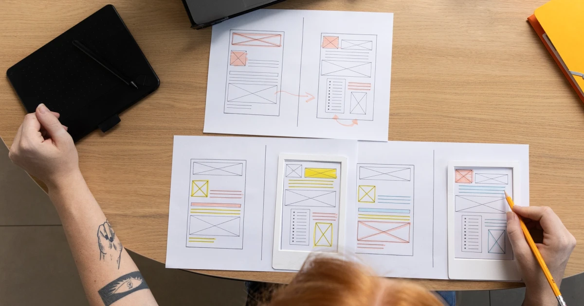
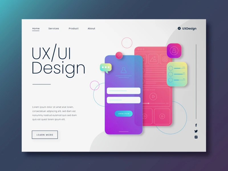
Visual hierarchy shouldn’t be neglected at all because it is one of the most important principles in UI/UX design.
Why is it so important? Well, mostly because it is completely shaping the way users interact with an interface. Instead of reading every word from top to bottom, most users prefer to scan a page to find the details they need.
To facilitate this action, most webpages should have a clear hierarchy because it guides their attention to the most important elements first. But when a clear hierarchy is missing in a website, users will rapidly feel overwhelmed, and they will try to leave the page as fast as possible.
The design is not always the key to attracting users if the information is hard to find in that design.
Common Visual Hierarchy Mistakes
Obviously, the biggest goal of visual hierarchy is to help users understand which details need their attention first. So, let’s get into the most common mistakes that make an interface hard to navigate.
- When everything competes for the user’s attention
Some elements are indeed very important, but every element should stand out in order not to all be at the same time, to make sure that each element is properly seen by visitors. Using too many bright colors, bold buttons, and large headings will create visual overload, and users don’t want that.
The best way to do this is by highlighting one primary action and letting supporting elements have a secondary role.
- When the contrast is weak between important and secondary elements
A good visual hierarchy is always based on a great contrast between elements, because if a heading looks the same as the body beneath it, the call-to-action will blend into the background. Think about it: you click on a website, and the first thing you see is a big block of text, which is hard to read. You will feel confused because you will not know what action to take.
This is exactly the thing visual hierarchy wants to avoid, because every key element should stand out for a specific reason.
- When the typography is poor
Typography plays a major role in helping users understand content. When headings are too similar in size to body text, heading styles are inconsistent, or too many font weights are used, the page becomes harder to navigate.
So, users need more time to figure out what they should read first. A simple and consistent heading system makes content easier to scan and creates a smoother reading experience.
- When the whitespace is neglected
Whitespace is also important besides the content of the website. When layouts are crowded and elements are placed close together, visitors will have a hard time understanding the website.
Make sure to add whitespace between sections, and grouping related elements helps create a clearer structure and allows users to process information more comfortably.
40% OFF
Only this February
Upgrade to UI PRO version of Uinkits Systems to unlock 23.000 UI components.
Use the code "FEB40"
- When a website has too many calls to action
Every website has a call to action, but is it clear so users can read it fast? But this action can become difficult when different calls to action compete for visitors' attention.
Buttons like "Buy Now," "Learn More," "Subscribe," "Book Demo," and "Download" can quickly overwhelm users if they all appear with the same level of emphasis.
It’s important to focus on one primary call-to-action that stands out, while making secondary actions less visually prominent so users always know what to do next.
How to Improve Visual Hierarchy
After we talked about the most common mistakes, let’s talk about how websites can improve the visual hierarchy fast.
Firstly, it’s important to identify the most important action and make sure it receives the best attention. Try not to highlight too many elements at once, and use the spacing and contrast to guide users through the website’s content.
Test your designs with real users in order to see the areas that drive most confusion. If users hesitate or struggle to understand where to click next, the visual hierarchy may need improvement.
uinkits – Our Figma Design System and UI Kits
We at uinkits understand the importance of great user experiences and creating amazing UI designs. That’s why we’ve developed a Figma UI Kit with design components that include these essential UI elements that enable you to design intuitive and user-friendly interfaces effortlessly.
“You press the button, we do the rest.” – Kodak.
Inspired by this iconic tagline from Kodak, we believe in simplifying the design process for you. Our Figma UI Kit, uinkits, is a complete design system with UI components that allows you, as a UI UX designer, to create your products as quickly as pressing a button.
Our design system includes UI components, icons, variables, cards, buttons and everything you need for your design process. All you have to do is take your UI design component needed, and you’re ready to use it in your designs!
By
Cristi Fonea
•
July 29, 2026