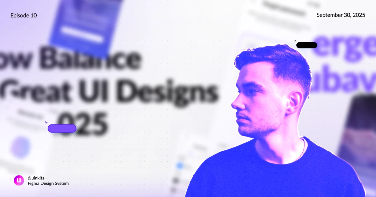


“The key is finding the right balance between depth and accessibility.” – Sergey Lyubavsky, Senior UI/UX Designer, Art Director & Mentor
As designers and as people, there’s one thing that we’re always chasing: balance. Whether it’s trying to navigate the balance between clarity and complexity in a UI/UX design process or juggling work and personal life, the push and pull never really stops.
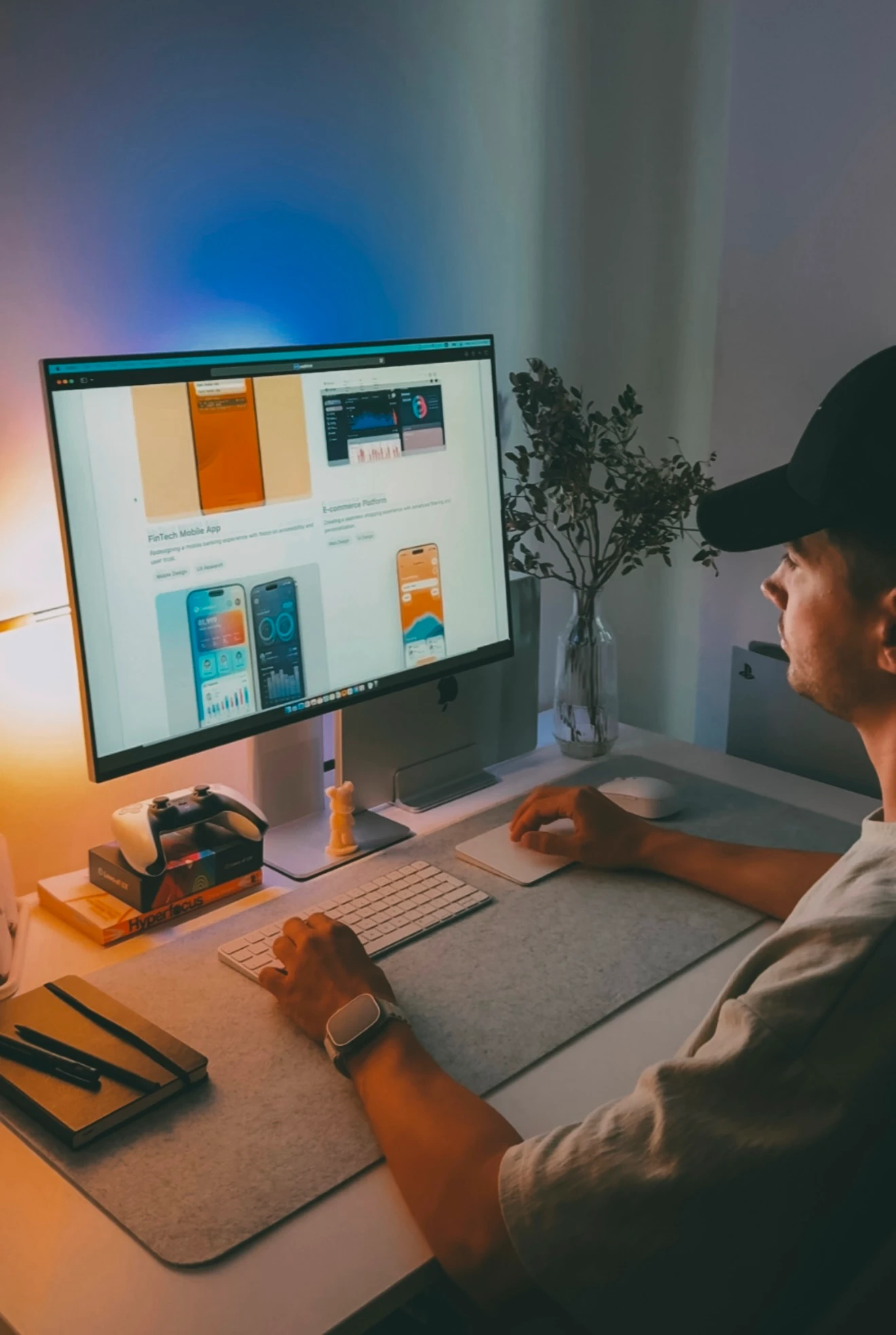
Sergey Lyubavsky knows this firsthand. As a senior UI/UX designer, art director, mentor, and content creator – all in one – that balance is necessary to switch between his processes. But that’s what makes him just so good at what he does. He’s searching for that sweet spot: where design feels functional, but still human.
“The ability to take chaos and turn it into something clear and functional is incredibly inspiring”, reveals Sergey.
Just like many other UI/UX designers, Sergey has always been “drawn to the visual side of things”, as he loved creating beautiful designs where everything was in the right place. But over time, that fascination turned into something more: “learning how design influences perception, behavior, and trust”.
The balance between the visual and functional aspects became the heart of Sergey’s creative process.
Let’s face it! Designers often have to deal with different kinds of work – sometimes creative, sometimes more structured. But this switch might not always come so easily for some of us. I, personally, still struggle with this from time to time.
But Sergey seems to have figured out the secret to it – even though he admits that “it took me some time to fully adapt”. His approach is simple, yet powerful: be fully present in whatever you’re doing.
Whether it’s filming a quick meme or leading his design team, Sergey commits to the process, not just the outcome.
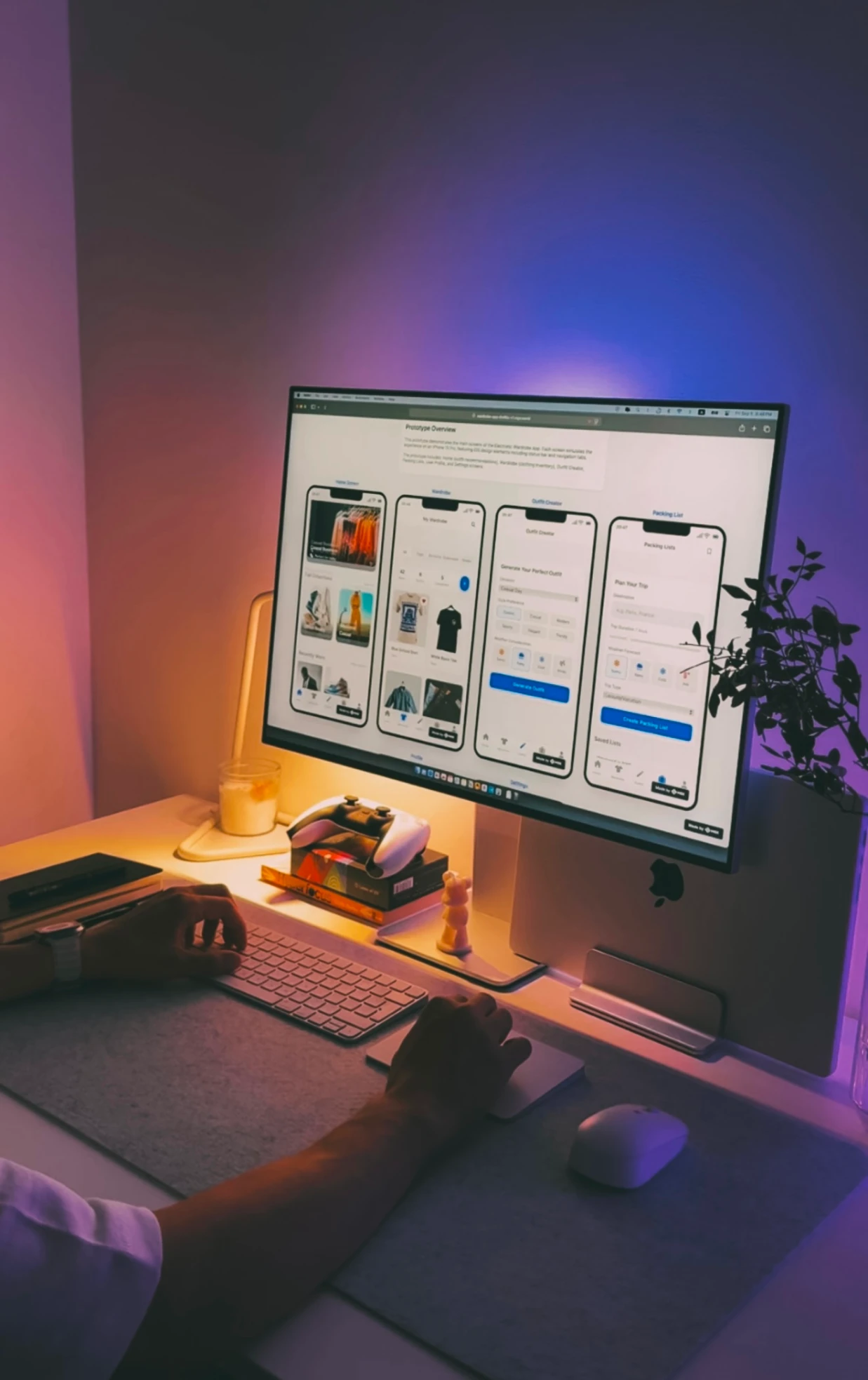
As an art director and senior UI/UX designer, Sergey focuses more on structure, goals, and details, to be able to think systematically and plan every step of the process. This requires calmness and careful planning, and focusing on the “why it matters”, not just “how it looks”. This is how you keep product and business goals in line.
But when he switches into content creator mode, it’s a different story – that’s where spontaneity takes over. It’s less about structure and more about instinct, moving quickly, and trusting his visual sense and creativity. This is why speed and emotional connection with the audience are just so important here.
Two very different headspaces, yes, but Sergey has found a rhythm that lets him move between them without losing momentum and still allowing himself to have a structured mindset. This is something that we should always learn. Plus, that’s how you can also make your designs feel playful and human, while still being strategically built.
“I’ve learned to find a balance between these two states — first building a solid foundation and set of rules, then giving myself the freedom to experiment and improvise.”

Sergey Lyubavsky is known for the countless designers he’s mentored, led, and reviewed over the years. But the teaching wasn’t one-sided. While guiding others, Sergey was also learning – about his process, his blind spots, and, overall, about what actually matters in UI/UX design.
He admitted that “sometimes, a single simple question from a junior can reveal a blind spot in my own process”. This is how we can ensure that we’re not getting stuck in certain habits, and we’re able to explore new approaches and perspectives.
Being in the UI/UX design industry means that you’re committed to always learning. Always wanting to stay up-to-date with the latest trends, tools, and updates. And always wanting to become a better designer. This mindset is exactly what Sergey has built his foundation on.
“Funny enough, when you explain your design decisions to others — especially junior designers — you start to understand your own reasoning much better”. And it couldn’t be more true! This way, we learn how to pay attention to the logic behind our design decisions – something that led Sergey to become more flexible and confident.
Learning is a continuous process as a UI/UX designer.
This mindset goes beyond just his mentorship sessions. On social media, he shares design tips, tutorials, and even memes – all with one goal: make design feel approachable, practical, and just a little more human. “It’s important to me that viewers not only gain knowledge but also feel a genuine connection, so that design feels not just like work, but a real creative process”, admits Sergey.
We’ve heard a lot of opinions on what it means to create a UI/UX design that truly stands out. Maybe it’s the animations and motion graphics that blow your mind. Or maybe it’s the clean layout. Or maybe just how easy everything feels.
But for Sergey, good UI design in 2025 is “more than just a beautiful and usable shell”. It’s about designing highly contextual and adaptive interfaces and helping them reach their goals – with minimal effort. In other words, the real success lies in how well the user understands and responds to the design.
This is similar to what Steve Jobs said: “Design is not just what it looks like and feels like. Design is how it works”. And although this statement goes back to 2003, it still deeply resonates today – maybe even more so.
In 2025, with the increasingly powerful tools and shorter user attention spans, the responsibility of a designer has become more on providing our users with everything they need, with a single click. Sergey admitted that, yes, at the beginning, his focus was also on visual aesthetics. But over time, that focus shifted to a “deeper meaning”.
“It’s no longer just about buttons and colors – it’s about creating an experience that solves real problems and makes interactions feel more human.”

Fundamental design principles like hierarchy, spacing, and contrast are exactly what junior UI/UX designers must master to create a really good UI design, says Sergey. And he’s right! They are the foundation for guiding users effortlessly through an interface.
After reviewing a lot of designers and portfolios, Sergey reveals that, unfortunately, this is a common mistake among juniors, but also seniors. The good news, though? It’s not about skill. It’s a matter of awareness and visual sensitivity, abilities that can be built over time with daily practice.
Modern UI is finding the right balance between depth and accessibility.
This balance shows up in every decision that Sergey makes, from his design projects to his content online. He explained that it’s important to him that “the content is useful and relevant for the audience”, so he focuses on common questions and real pain points. By adding personality and humor to his content, he humanizes that information in a way that feels both memorable and meaningful. See? Balance!
Of course, we have to talk about the elephant in the room – AI tools. There’s no denying that these have significantly changed (and will continue to) the UI/UX design industry. Everything has become easier and faster, and everyone is using them, even if it’s just for basic tasks.
While many of us think that these design tools might lead to standardized experiences and maybe even replace designers altogether, Sergey sees it completely differently. He believes that true personalization comes from a deep understanding of users’ needs and emotions – something that artificial intelligence is far from achieving.
“AI is more of a helper that expands a designer’s capabilities rather than replacing the uniqueness of the human touch.”
The AI trend has pushed toward another trend: fast content, that led to shorter attention spans. This has affected all industries, not just the UI/UX design field. This is why it’s necessary to create simpler and clearer interfaces, where “everything is as quickly and clearly as possible”.
That’s where the fundamental principles of hierarchy, spacing, and contrast become even more important. We must use them thoughtfully to create clarity in every interaction.
Sergey expresses again the idea of balance, emphasizing that while speed and clarity are essential, designers must not lose sight of depth and quality of interaction. This is why the future of design will force us to “make design more focused and effective”, which, in his opinion, is “only beneficial for the industry”.
So, what’s the secret to using powerful design tools while also keeping it personal? Simple, UI Kits. This way, we can streamline the process without sacrificing meaningful and human-centered design.
“Tools like Uinkits are transforming UI/UX design workflows by making them faster and more convenient. These platforms give designers access to ready-made components, templates, and resources, which saves time on routine tasks and helps move more quickly to creativity.”
To Sergey, the future of design is all about finding the perfect balance – between innovation and empathy, efficiency and depth, technology and the human touch. Because no matter what, the heart of a good UI/UX design will always be based on understanding people.

