Many small businesses, startups, or freelance web designers face the same challenge: how to make a site look polished and professional without a costly budget?
We are lucky technology has advanced so much! Just think about it. Platforms have evolved, and their tools are easier to use. Even more so, for those who don’t want to start from scratch, ready-made resources are as customizable as they get!
Limited resources are no longer stopping us from designing our online presence and offering smooth user experiences for our users. The good news is you don’t need a full design agency to get there.
So, where to start?
Website design is the process of building a website’s appearance and functionality. It involves shaping the creative design idea, creating a plan, and arranging content.
Designers spend hours on making sure their work is visually pleasing, choosing the best color pallets and page layout. But this is not all! They design with functionality and usability in mind. It’s not just about looks. A beautiful website will be quickly forgotten if it doesn’t easily respond to users’ needs.
In other words, website design is not just decoration, it’s communication. It helps visitors understand what the website offers and makes it easy (and enjoyable) for them to take action.
Make sure you choose a complex UI/UX design tool to create wireframes, design mockups, prototypes, and collaborate in real-time with your team.
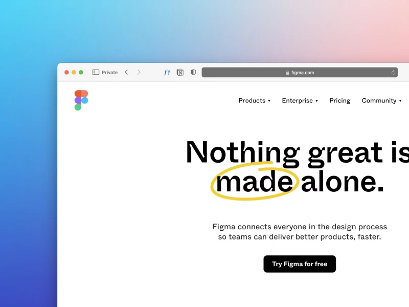
Figma is such a reliable option, providing a wide range of key features and elements: frames, components, auto layout design, a prototyping mode, and others. Trust us: it’s a great place to start, even with low resources.
1. Wireframes
Become best friends with wireframes. These simple sketches help you have a clear vision of the final layout. If you want a ready-made layout, you can choose a template from the Figma library. But if you want to learn layout design, is best to structure it yourself.
This won’t be difficult thanks to wireframes. You can create them by digitally sketching boxes and placeholders for the header, main content area, and footer. Make a layout design for all your essential pages, like your About, Blog, or Contact sections.
2. Simplicity
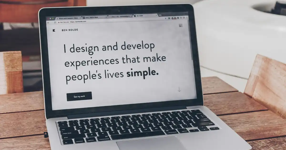
Embrace simplicity on your homepage. This is the touchpoint that first conveys your core messages. You want people to see your website and instantly know who you are and what you communicate. Why not show them everything at once? Because attention spans are low, and they don’t usually read, they just scan the page.
With this in mind, place important content at the top of the page. It has to be concise and well-spaced for more balance. Otherwise, it will look cluttered and hard to “scan” - that's one of the most important rules when it comes to having a clean website.
When it comes to alternative ways to convey your messages, high-quality media will do the trick. They can be images, icons, or vector art. Let creative design enter the room!
3. Readability
In terms of content, “readability” matters most. Use a high contrast between your background and text colors. If it doesn’t pop up, it might be considered skippable information in the “scanning” process we talked about.
Also, consider font key rules! Use a large letter size for your body text and pick your font wisely. You can opt for font pairings or the ones in the decorative spectrum, but make sure not to overuse them. You probably don’t want to have a carnival look. Unless… you're designing a website for one?
4. Easy to Navigate
Now let’s see what you can do to make your site easy to navigate. Your visitors probably don’t want to feel like they’re in an escape room. Let them easily find what they need and create intuitive functions.
Did you know most visitors expect your logo to link to the homepage? They also often look for a menu, so make it stand out. Menu sections should be structured naturally, by importance. In the ending scene - your footer - you should include contact information and key links, without making it look too overwhelming.
Even more so, you should consider staying mobile-friendly. The mobile world is continuously evolving, and your work should be enjoyable on any screen size.
- 2-Seconds. That’s how much time your users can wait for your buttons to react and your pages to react, without losing patience. This rule teaches us a simple lesson: the less time users are kept waiting, the better the user experience.
- 3-Click Rule suggests that if users don’t get to what they are searching for in three clicks, they will give up. But the truth is, it’s not really about counting clicks. What matters more is that the path feels clear and natural. As long as users aren’t lost and can easily know what’s next, they won’t mind taking a few extra steps.
- Don’t make users think. Visitors shouldn’t have to stop and figure things out. They should just get it.
When navigation or page layouts are confusing, visitors end up with more question marks in their heads, wondering what to click or where to go next. The key? Keep things intuitive. Use clear structure, familiar design patterns, and visual hints to gently guide users toward their goals without overloading them with decisions.
Professional website design is more than just looks. It’s about making your visitors feel guided, welcomed, and never lost!
Even if your resources are limited, you can still level up your website design by borrowing smart principles from digital designers and usability pros. Good creative design doesn’t have to mean expensive. It’s all about using what you have with purpose and clarity.
Actually, constraints can fuel creativity. When you’re working within limits, you’re encouraged to focus on what really counts: clear layout design, intuitive navigation, and user experiences that feel natural.
We at uinkits understand the importance of great user experiences and creating amazing UI designs. That’s why we’ve developed a Figma UI Kit with design components that include these essential UI elements that enable you to design intuitive and user-friendly interfaces effortlessly.
“You press the button, we do the rest.” – Kodak.
Inspired by this iconic tagline from Kodak, we believe in simplifying the design process for you. Our Figma UI Kit, uinkits, is a complete design system with UI components that allows you, as a UI UX designer, to create your products as quickly as pressing a button.
Our design system includes UI components, icons, variables, cards, buttons and everything you need for your design process. All you have to do is take your UI design component needed, and you’re ready to use it in your designs!