If you’re reading this, there’s a good chance you’re either working on a new SaaS product or thinking about it, which is exciting and a little overwhelming, let’s be honest.
SaaS (Software as a Service) has exploded over the last decade, and with that growth comes some high expectations around product design. Good SaaS product design isn’t only about things looking pretty, but making users come back and ideally recommending your product to others.
From the way your sign-up flow works to the dashboard layout, every little detail matters, trust me. The good news? You don’t need to reinvent the wheel. But you do need to understand what makes a great SaaS product stand out.
What is SaaS product design?
If you’re new to the game, let’s keep it simple. SaaS product design is the process of designing the user interface (UI) and user experience (UX) for cloud-based software that people access online. Think about platforms like Notion, Slack, or Dropbox.
Because SaaS lives online, everything from the login page to feature rollouts needs to be clear, consistent, and user-friendly.
Unlike traditional software, SaaS has to work for a wide range of users across devices, industries, and sometimes languages. That means flexibility, responsiveness, and scalability are all baked into the design process.
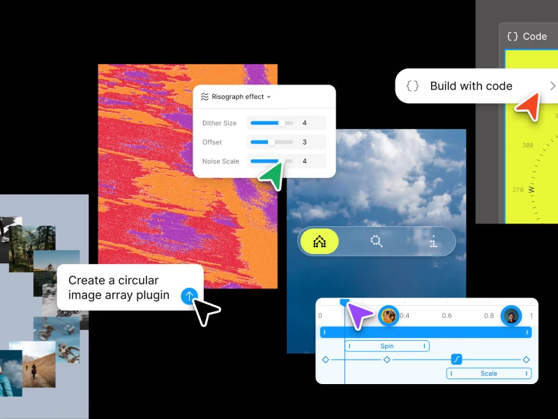
Key Principles of SaaS Design
If you look at how successful SaaS companies approach product design, you’ll start to notice a few patterns. Here are some core principles to keep in mind:
1. Simplicity wins
A SaaS product interface should never feel cluttered or overwhelming. When a user logs in, they should intuitively know where to go and how to accomplish their task without having to dig around. The goal is to strip away anything unnecessary, leaving only the essential elements that guide the user towards their objectives.
When your SaaS product is simple to navigate and use, it reduces frustration, boosts efficiency, and makes your users more likely to stick around. Remember, every extra click or moment of confusion can be a point of friction. So, make sure that your sidebar is on point!
2. Onboarding
First impressions matter. If someone signs up and has no idea what to do next, they’ll bounce. Design a helpful, step-by-step onboarding process, and make it visual.
Designing a helpful, step-by-step onboarding process isn't just a nicety; it's critical for user retention. Make it visual, interactive, and focused on helping users achieve their first "win" quickly.
3. Consistency builds trust
Consistency applies to interactions too. If a button does one thing in one part of your app, it should do the same thing elsewhere. This predictability creates a sense of reliability for the user, fostering a feeling that your SaaS product is well-thought-out and dependable. It’s a subtle but powerful way to communicate quality in your SaaS product design.
Use consistent colors, typography, and button styles throughout your SaaS product. Users feel more confident when the design feels familiar and predictable.
4. Scalability is non-negotiable
As your product grows, your design should grow with it. Build modular UI components and plan ahead for more features. That way, you’re not redesigning every time the product evolves.
Planning for scalability means thinking about how new features will integrate without disrupting existing workflows or cluttering the interface. It’s about creating a flexible framework that can adapt to future needs, ensuring your SaaS product design remains robust and user-friendly even as its complexity increases.
5. Feedback
Give users real-time feedback. Whether they’re saving changes, uploading a file, or completing a task, microinteractions are small but powerful.
40% OFF
Only this February
Upgrade to UI PRO version of Uinkits Systems to unlock 23.000 UI components.
Use the code "FEB40"
Looking for design inspiration?
Here are a few SaaS companies that, in my opinion, really get it right:
Notion – Clean layout, beautiful typography, and super flexible UI blocks that feel empowering rather than limiting. Their ability to manage diverse content while maintaining visual order is top-tier design inspiration.
Airtable – Intuitive tables and views that make even complex data feel manageable. Plus, their onboarding is chef’s kiss – a perfect example of guiding users to immediate value.
Figma – A perfect example of a tool that balances simplicity with power. Their SaaS website design is incredibly clean and inviting, and the product itself focuses on collaboration without overwhelming new users. You know exactly what to do from the moment you land on the dashboard, making it a masterclass in direct usability.
Slack – Although loaded with features, the interface doesn’t feel chaotic. The thoughtful use of color, spacing, and animation makes navigating the app feel smooth. Plus, their attention to microinteractions makes even loading screens feel intentional and engaging
Common Mistakes to Avoid in SaaS Product Design
Even experienced teams can fall into some common traps when building out a SaaS product. So here’s your heads-up:
One of the biggest mistakes? Overdesigning. Just because you can add gradients, shadows, and all those extra things doesn’t mean you should.
Another one? Forgetting about the empty state. A new user logs in, and… there’s nothing there. Blank dashboards with zero guidance are a missed opportunity. Always give people a sense of what’s next, even if that means a simple illustration with a line like “Let’s get started.”
A lot of SaaS companies also underestimate the importance of mobile. Even if your users mostly access your platform from desktop, mobile-responsiveness is a trust signal. If your design breaks on a phone, users assume your product will, too.
And finally: skipping user testing. Just because your team understands the flow doesn’t mean everyone else will. Testing early and often will save you hours (and headaches) later on.
uinkits – Our Figma Design System and UI Kits
We at uinkits understand the importance of great user experiences and creating amazing UI designs. That’s why we’ve developed a Figma UI Kit with design components that include these essential UI elements that enable you to design intuitive and user-friendly interfaces effortlessly.
“You press the button, we do the rest.” – Kodak.
Inspired by this iconic tagline from Kodak, we believe in simplifying the design process for you. Our Figma UI Kit, uinkits, is a complete design system with UI components that allows you, as a UI UX designer, to create your products as quickly as pressing a button.
Our design system includes UI components, icons, variables, cards, buttons and everything you need for your design process. All you have to do is take your UI design component needed, and you’re ready to use it in your designs!
By
Gabriel Pana
•
July 18, 2025


