The call-to-action message represents an important attribute that every landing page should have because it can convince website visitors to become actual customers. CTAs play the role of capturing the visitor’s attention and significantly boosting the conversion rate.
If you have a website that struggles with keeping users engaged and convincing them to become customers, maybe you need to have a better understanding of the CTA principles and how to create some impressive messages to increase conversion rates.
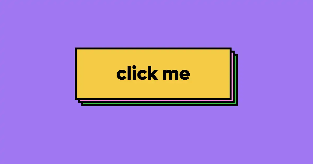
A call-to-action represents a web design and marketing element that convinces visitors to take a desired action. Seen usually as a button, message, or even link, the CTA has the crucial role of persuading them to subscribe to a certain service or make a purchase according to the brand’s needs.
Every CTA relies on behavioral psychology. So, all human decisions are influenced by different emotional triggers, which marketers use in order to convince them to take a desired action. Usually, a call-to-action message can trigger the FOMO feeling, also known as Fear of Missing Out, because it is able to create urgency and push users to take action in order to avoid losing a valuable opportunity.
Also, the call to action message depends on the reciprocity principle because it offers something valuable, such as a free gift or a discount, to users in exchange for their actions.
So, users visit different websites because they have different goals, needs, or desires, such as making a purchase or finding information. Make sure to create call-to-action messages that can fulfill these needs and desires to increase the conversion rate.
Types Of Call-To-Action Messages
- Engagement CTA: a message that encourages website visitors to interact more with the website or platform. Here, a call to action example can be “Read more” or “Share your experience”.
- Lead Generation CTA: represents messages that collect the visitor's personal information (email address), offering in exchange something valuable, such as a cause, newsletter, or discount coupon. For this, you can use one of these CTA examples, such as “Download now your free course”, or “Sign up for the latest news”.
- Sales CTA: These messages are especially created to increase the number of purchases and subscriptions. For Sales CTA messages, you can use different call-to-action examples such as “Start your free trial now”, or “Buy now to save up to 30%”.
Creating a high-converting CTA for your website involves more than just some catchy words; it’s about combining some marketing principles to guide the user’s behavior through the interface.
1. Clarity in the CTA message
Having a simple and easy-to-understand CTA message increased the chance of convincing users to take a certain action without issues. So, make sure to avoid unclear words and phrases that could confuse them, and use powerful words that can express the action needed.
2. Personalization
A convincing call to action message should be personalized to target the needs and preferences of users. A customized message will increase the chances of keeping the target audience engaged and interested in your products or services.
3. Attractive design
The design is an important factor that can determine the effectiveness of a call-to-action message. Try to create it with contrasting colors that highlight the CTA and attract users to click on it. Red can create urgency, so it’s perfect to use in websites focused on sales, while green is widely considered the color of positivity and growth, so it is more effective for platforms that provide subscription plans.
Lastly, for more professional services, such as B2B websites, blue is the best choice because it builds trust.
4. Placement
The CTA placement can make a significant difference in its effectiveness. If you place the CTA above the fold, users will see it almost instantly, so the need to scroll is successfully avoided. Placed at the end of the content, the call-to-action message will be easily seen after reading an article or a product description.
The secret is simple: get a better understanding of your target audience and create a call-to-action message that manages at the same time to grab the user’s attention and drive actions.
We at uinkits understand the importance of great user experiences and creating amazing UI designs. That’s why we’ve developed a Figma UI Kit with design components that include these essential UI elements that enable you to design intuitive and user-friendly interfaces effortlessly.
“You press the button, we do the rest.” – Kodak.
Inspired by this iconic tagline from Kodak, we believe in simplifying the design process for you. Our Figma UI Kit, uinkits, is a complete design system with UI components that allows you, as a UI UX designer, to create your products as quickly as pressing a button.
Our design system includes UI components, icons, variables, cards, buttons and everything you need for your design process. All you have to do is take your UI design component needed, and you’re ready to use it in your designs!