At the recent WWDC 2025 event, Apple revealed a new and completely interesting redesign of its existing software, including macOS, iOS, iPadOS, and all other operating systems.
But after the Apple WWDC 2025, various people, including UI designers, UX designers, developers, and other specialists from the industry, have expressed their opinions about the Liquid Glass design, and its similarities with other operating systems that have been a trend in design.
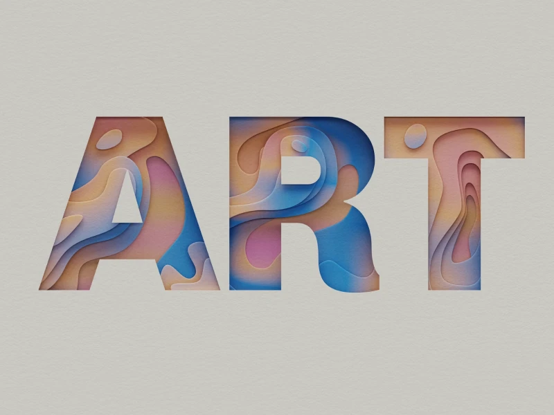
What is Apple’s Newest UI Design? Liquid Glass Design
We must admit that the Apple announcement represents a turn in all UI/UX trends because most designers and specialists in the industry have considered Apple as a standard for all projects in design.
Characterized by transparent elements and smooth effects, at its core, the Liquid Glass design aims to imitate the look and even the feel of a smooth glass. So, with its new UI design, Apple wants to include fine light reflections, with transparent elements and smooth gradients.
If we compare the new iOS 26 that is about to be launched in a couple of months, it is surely more dynamic and offers an enhanced sensorial experience than the iOS 7 version, which was focused on a completely flat design.
It seems that Apple really succeeded in implementing the glassmorphism approach into an interface that allows constant interaction. Also, we can’t forget about the fact that there are also included elements such as blur effects or adaptive color shifts, which are specific to Apple.
Why is Apple's Liquid Glass design controversial in UI/UX design?
If you think that this new Apple design seems familiar, then you are not wrong. Even if it’s really a new approach compared with the previous Apple operating system design, the “glass” effect has been used by other companies in the past.
Remember the Windows Vista “Aero” interface? If you had the chance to work with this interface, then this one may seem very familiar to you. Windows Vista debuted back in 2007 with a similar design that imitated the transparent look of glass. Back then, this operating system was indeed a trend, which continued into Windows 7, but soon retired with the launch of Windows 8 and Windows 10.
It’s important to mention that this interface change will not affect how users will use their Apple devices, but it has the purpose of enhancing and making the whole experience much more enjoyable and more customizable. With glassy effects and transparent icons & backgrounds, Apple’s purpose is to bring a new perspective to all everyday tasks.
Various specialists in the industry, from UI/UX designers to developers, stated that they have a hard time adapting to the new Apple design, considering the fact that their devices had almost the same interface for many years.
40% OFF
Only this February
Upgrade to UI PRO version of Uinkits Systems to unlock 23.000 UI components.
Use the code "FEB40"
Is Liquid Glass A New Chapter In UI/UX Design?
With a focus on providing clarity and elegant elements, Apple managed to create a UI that is really responsive and captivating for all tech enthusiasts. The new iOS design indeed brings back depth and dimension without relapsing into skeuomorphism. So, with all the translucent layers and subtle animations, it makes all the device's interfaces feel intuitive.
But it manages to spark interest through its tactile quality, which is triggered after every action and finger tap.
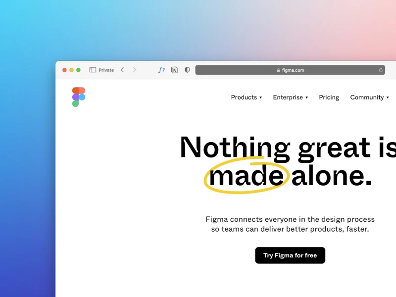
So, Apple’s Liquid Glass design represents more than a visual refresh - it marks a twist in how users are interacting with digital UI interfaces. Until now, Apple was based on minimalism, but now it is able to blend the aesthetic approach with movement and clarity, in order to set a new trend in UI/UX design.
uinkits – Our Figma Design System and UI Kits
We at uinkits understand the importance of great user experiences and creating amazing UI designs. That’s why we’ve developed a Figma UI Kit with design components that include these essential UI elements that enable you to design intuitive and user-friendly interfaces effortlessly.
“You press the button, we do the rest.” – Kodak.
Inspired by this iconic tagline from Kodak, we believe in simplifying the design process for you. Our Figma UI Kit, uinkits, is a complete design system with UI components that allows you, as a UI UX designer, to create your products as quickly as pressing a button.
Our design system includes UI components, icons, variables, cards, buttons and everything you need for your design process. All you have to do is take your UI design component needed, and you’re ready to use it in your designs!
By
Cristi Fonea
•
June 11, 2025


