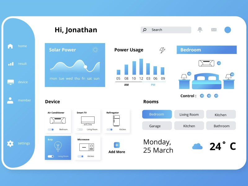
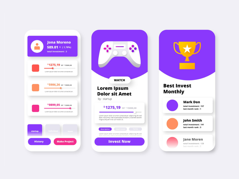
Let me tell you, probably the most important aspect of the Gestalt principles of grouping, which represents currently a standard group that must be followed when designing a website page, an app, or any UI/UX design.
Gestalt principles are mostly created to standardize the way that designers create interfaces that can attract and maintain users' attention without any disturbing elements or notifications.
Do you know the origin of the name Gestalt? Well, Gestalt originally came from the German words “Shape” and “Form”. So if we translate them, these principles of design have been made to explain exactly how users understand the group elements, and how designers can pair them together in order to establish a smooth user experience.
This law can explain very simply how humans, especially the human mind, perceive different visual information, such as objects or elements placed nearby. So, basically, this Gestalt principle states that humans are usually perceived as a group, with the elements that are placed very close together.
In a design, photography, or document, when some elements are placed really close together, the human mind will automatically understand that they are somehow related, and will perceive them as a similar element or with a similar purpose.
This also applies in UI/UX design, where everything is created for users and their smooth experiences. Designers follow this Gestalt principle in almost every design in order to make the website or app more intuitive to use.
The Gestalt law of proximity represents a crucial aspect, especially for the visual hierarchy, because when elements are correctly grouped, users will understand much more easily that they belong together.
This principle relies on the spacing between elements because the spacing can have a significant impact on how users perceive the webpage. For example, when UI/UX designers want to separate elements and make users understand that those elements don’t belong together, they usually use lines, borders, or other related elements to make it somewhat obvious.
Usually, when elements are organized and grouped according to their purpose, this significantly helps to reduce the cognitive load in the navigation experience. This way, users will not need to think about which images or buttons go together, and instead, they will be able to focus more on the tasks that matter.
Even more so, the visual hierarchy will be maintained because users will scan the webpage in a logical order, allowing them to enjoy the experience.
It should be mentioned that the Law of Proximity has a higher efficacy when implemented in UI design layouts to determine the perfect spacing between elements.
- Navigation Menu - here, the proximity principle can be implemented in categories such as “About”, “Contact”, or “Careers”, where the links that redirect users to these website categories are grouped very close together. This way, users will find out the important information that they need much quickly. When a menu is not carefully designed, the website can be easily considered confusing.
- Website Forms - the law of proximity matters here because the website forms need to be carefully designed in order to make the filling process much easier for users. It’s important to make sure that each of the fields and labels is assigned correctly because even the slightest mistake can confuse users, and push them to leave it incomplete.
- Call to Action Website Section - the call to action buttons, such as “learn more” or even “subscribe”, are important parts of a website, because if they are misplaced or too close to another important element, they have a higher chance of being ignored by users.
What are the most common mistakes you should avoid when applying the Law of Proximity?
We must admit that in user interface design, the Law of Proximity represents a crucial aspect of every website design.
Sometimes, the most common mistake is probably when UI/UX designers try to design multiple elements in a smaller space. This way, the information is hard to read, and sometimes users will avoid going over it. Instead, it’s important to make sure that all elements have their determined place, and can be easily understood by users without trouble.
But the correct spacing is not enough to make sure that a website is visually appealing. Keep in mind that other important aspects contribute to a visually appealing website, such as colors, typography, or placement.
After all these tips, you should be able to design the perfect website that features the law of proximity in the best way possible.


