Imagine doing your groceries in a supermarket where every aisle is rearranged daily. You’d have to relearn every day the path to bread and where the dairy is. It would be totally confusing, and customers would likely start to avoid it or quit mid-session.
Why would someone want to rediscover different aisle models and supermarket paths, when only two roads away, they have a familiar and intuitive option?
When people have a goal (to apply to a job, to download a UX kit, or even to buy groceries), innovation and creativity come second. What they need is to find the rice near the pasta aisle, and the main buttons where they’re used to seeing it on other websites.
This is a natural human tendency, explained by one of the core UX principles: Jakob’s Law.
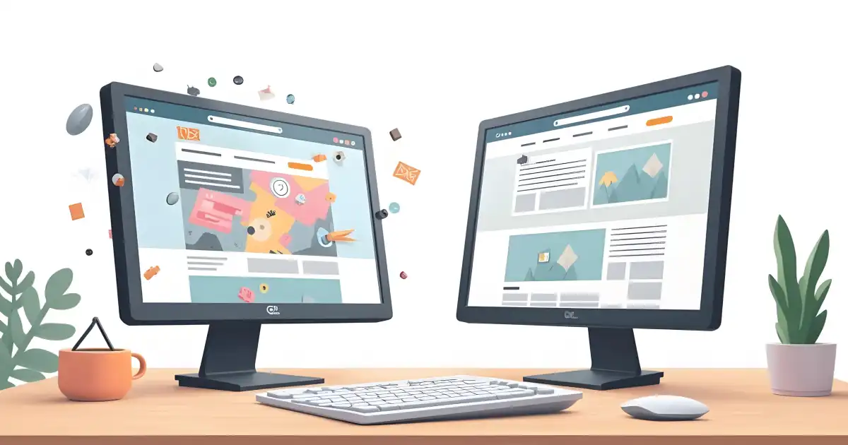
This law of UX states that, because a user spends most of their time on other websites, they form expectations based on familiar patterns. They know where to look, what to click and how to move forward, and…they want things to stay that way.
Familiar Doesn’t Mean Boring UI UX Design
Familiarity means users can anticipate their next step. They don’t need to think about how to navigate a site, only about what they want from it. The moment this changes and they suddenly have to search for things, they feel disrupted and start getting annoyed. That leads to frustration, which builds up, and eventually can result in lost users and lost traffic.
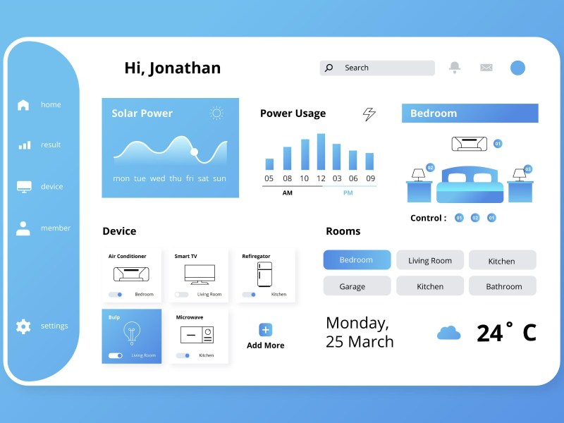
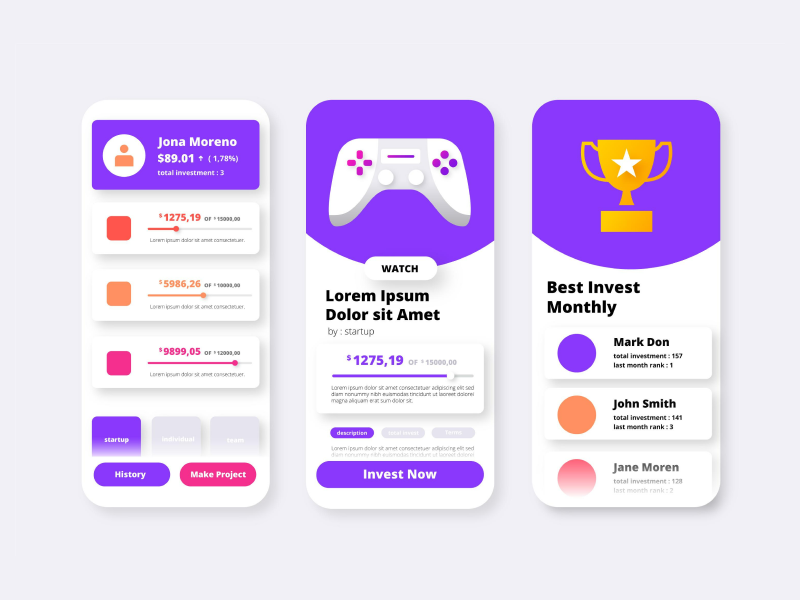
Does this UX law mean designers can’t get personal and creative? Absolutely not. The idea isn’t to design the same, but similar, especially in terms of usability. There are still plenty of ways to stand out through creativity, as long as it doesn’t interfere with usability or break familiar patterns.
Removing the search bar entirely? That’s a problem. But styling it with an animation or giving it a branded twist can add personality without compromising function. Think of it like designing a car: the color and shape can vary, but the brake should always be where drivers expect it.
Designing with Jakob’s Law in Mind
Unless your site is really small, having a search bar is a must. Users expect to see it right at the top of the page, usually on the right side, and as an open text box, not hidden behind an icon or menu. It’s a small detail, but following this pattern makes a big difference. When people can find what they need without thinking twice, they’re much more likely to stick around.
You already know that little cart icon, unless you’ve been off the grid since Amazon introduced it back in 1994. With its help, your users know exactly where to click when they want to check what’s in their cart.
Want to move up and down a web page? Just scroll! Thanks to visible scroll bars and familiar interface elements, users instinctively know what to do.
Pinch-to-zoom is second nature on mobile. Users love apps that follow this pattern, and get annoyed by the ones that make them jump through hoops just to zoom in.
Call-to-action buttons might seem like they’re shouting at users with bold colors and high contrast. But because nearly every site uses this approach to highlight key actions, users have come to expect it.
If your “Add to cart” or “Subscribe to Newsletter” button blends in too much with the rest of the page, users might simply miss it. When it comes to CTAs, standing out is part of being user-friendly.
40% OFF
Only this December
Upgrade to UI PRO version of Uinkits Systems to unlock 23.000 UI components.
Use the code "DEC40"
The Cost of Breaking the Pattern in UI/UX Design
Breaking away from familiar design patterns might seem like a bold move, but it can come at a cost. A great example is Snapchat’s interface, which relies on hidden swipe gestures and a lack of visible navigation cues. The result? Confusion and abandoning the app.
While Snapchat eventually became popular with Gen Z users who stuck around to figure it out, many first-time users dropped off because they simply couldn’t figure out how to use the app.
When Microsoft introduced Windows 8, it removed the iconic Start button, a feature users had relied on for years. The sudden shift confused even experienced users. It led to widespread frustration and a steep decline in satisfaction. Many struggled to perform basic tasks like shutting down the computer or finding apps.
Microsoft eventually brought the Start button back in later updates, probably after realizing that when familiar patterns disappear, so can user confidence and loyalty.
These are clear cases of Jakob’s law being ignored: users spend most of their time on other apps and websites, so they come in with expectations. When those expectations are broken without a good reason, they won’t feel curious, but lost.
In the end, Jakob’s Law reminds us that familiar design isn’t about being boring; it’s about respecting the habits users have built across the web.
By following these core UX principles, you create a smooth and intuitive experience that builds trust and encourages users to take action. Embracing familiar patterns doesn’t limit creativity. It gives your design a strong foundation where innovation can shine without confusing your audience.
When you combine usability with a personal touch, your users feel confident and happy to stay. That’s the real key to boosting conversions and creating lasting connections.
Check out other laws in UI/UX Design:
uinkits – Our Figma Design System and UI Kits
We at uinkits understand the importance of great user experiences and creating amazing UI designs. That’s why we’ve developed a Figma UI Kit with design components that include these essential UI elements that enable you to design intuitive and user-friendly interfaces effortlessly.
“You press the button, we do the rest.” – Kodak.
Inspired by this iconic tagline from Kodak, we believe in simplifying the design process for you. Our Figma UI Kit, uinkits, is a complete design system with UI components that allows you, as a UI UX designer, to create your products as quickly as pressing a button.
Our design system includes UI components, icons, variables, cards, buttons and everything you need for your design process. All you have to do is take your UI design component needed, and you’re ready to use it in your designs!
By
Cristi Fonea
•
October 16, 2025


